What is Velora Stonecraft ?
Velora Stonecraft is a Tehran-based atelier creating one-of-a-kind hand-carved pieces from natural stone — sculptures, tables, tableware, accessories, water sculptures, and lighting.
The website is a portfolio-style showcase — not a transactional store. Its job is to present the atelier's work like an art catalogue, build credibility through process and story, and open a conversation with collectors and interior designers via considered inquiry paths rather than instant checkout.
Business Needs
- Present the full body of work — six categories — with the gravitas of an art catalogue, not a product feed.
- Build trust with high-value visitors through atelier story, process transparency, and clear contact paths.
- Open a single, considered inquiry path — collectors message the atelier; the atelier follows up personally.
- Reach international audiences — clean, English-led copy that doesn't alienate the Persian-speaking home market.
- Keep the visual system calm and photography-first; the design frames the work, never competes with it.
Design Goals
- Photography-first layouts with generous whitespace.
- Clear pathway: Browse → Detail → Inquire in three taps or fewer.
- A navigation that surfaces all six categories without feeling crowded.
- Mobile-first responsive design — high-end visitors browse on phone, decide on desktop.
- An atelier story page that builds emotional trust and signals craftsmanship before any price is mentioned.
Research and Design
- Stakeholder interviews
- Competitor audit
- Audience mapping
- Personas
- User flows
- Site map
- Content model
- Wireframes
- Mood Board
- UI Kit
- High Fidelity
- Prototype
- Iteration
- Developer Handoff
- Live Launch
Understanding the audience
Audience mapping
Three primary audiences emerged from stakeholder conversations:
The Collector
Browsing for unique sculptural pieces. Cares about provenance, materiality, and limited editions. Treats the site as a catalogue and reaches out personally.
The Interior Designer
Sourcing for clients. Needs clear specs, dimensions, and a quick path to inquire about availability or custom sizing.
The Discerning Home Buyer
Investing in a single statement piece. Wants reassurance — atelier credibility, process transparency, and a smooth consultation path.
Competitor audit
I reviewed leading luxury craft and limited-edition design platforms. Patterns I wanted to keep, and patterns I wanted to avoid:
Keep
- Generous whitespace and large product photography.
- Inquiry-first checkout for bespoke pieces (no aggressive add-to-cart).
- Atelier-process content as a trust-builder.
- Editorial type pairing — serif for display, sans for UI.
Avoid
- Overcrowded mega-menus that hide categories behind dropdowns.
- Aggressive CTAs ("Buy Now!") that feel mass-market.
- Stock imagery — every photo had to be of actual Velora work.
- Bright accent colours — they clash with stone tones.
Shaping the experience
Site map
I structured the site around five primary destinations and kept the navigation flat — three clicks to anywhere from the homepage:
- Home — atelier intro, featured pieces, pathway to all six categories.
- Categories — Sculpture · Table · Tableware · Accessories · Water Sculpture · Lighting.
- Piece Detail — large imagery gallery, materials, dimensions, edition note, single Inquire CTA.
- Atelier & Process — story page detailing the studio, hand-carving steps, and craftspeople.
- Contact — single inquiry form plus address, email, phone, Instagram.
Key user flows
Two journeys, both ending in the same considered inquiry — never an instant checkout:
Browse Flow
Home → Category → Piece Detail → Inquire. For visitors exploring the catalogue and finding something that resonates.
Story Flow
Home → About / Atelier → Process → Inquire. For visitors who buy into the brand story first, the work second — common with collectors and interior designers.
Content model
Every piece-detail page follows the same skeleton: Hero image gallery → Title → Category tag → Materials → Dimensions (customisable) → Edition note → Inquire CTA. The pattern stays consistent across all six categories so the experience feels predictable, calm, and easy to scan — like turning the pages of a curated catalogue.
Mood Board
The visual direction was set early: quarry textures, soft natural light, raw concrete, single-subject framing. Reference imagery came from architectural photography and stone-craft archives — never lifestyle stock.
- Stone surfaces — travertine, basalt, sandstone — as colour and texture sources.
- Architectural still-lifes for compositional rhythm.
- Editorial magazines (Cereal, Apartamento) for layout and type pairing.
- Calm, restrained palettes from interior photography of stone-led spaces.
UI Kit
A lean component library was built to keep production fast and consistent — every screen uses the same primitives.
Colour
Typography
Display / Headlines
Velora
Fraunces — variable serif
Used 32px+ for editorial impact and product titles.
Body / UI
Stonecraft
Inter — geometric sans
Used 14–18px for paragraphs, navigation, and form labels.
Components
- Buttons — primary outline (text + hover fill), secondary ghost, all 999px radius.
- Product cards — full-bleed image, title underneath, no description (kept for detail page).
- Forms — single-column, generous spacing, large tap targets (44px minimum).
- Navigation — flat horizontal on desktop, bottom-sheet on mobile.
Key Pages
The site shipped with five primary templates — each tightly scoped to one job:
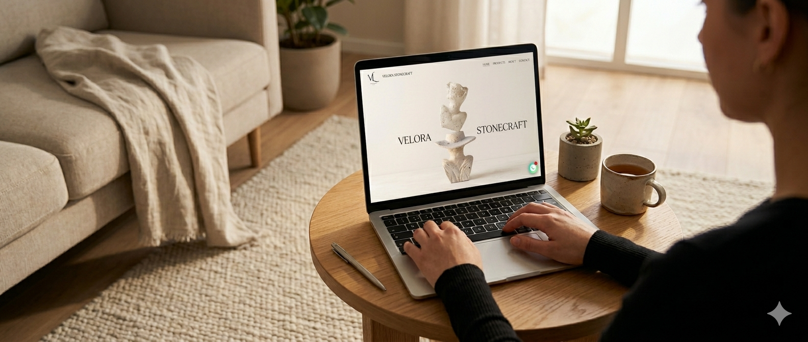
Home
Hero piece, six-category grid, atelier story teaser, featured commissions.
Category Listing
Two-column grid of piece cards, full-bleed photography, no filters — the list itself is the curation.
Piece Detail
Hero image gallery, title, dimensions, materials, edition note, single "Inquire" CTA — no add-to-cart.
Atelier & Process
Story page with founder note, hand-carving process in steps, and atelier imagery.
Contact
Single, generous inquiry form — name, email, message, optional reference piece — plus address, phone, Instagram.
Responsive & Mobile
High-end clients browse on phone, decide on desktop. The mobile experience had to feel as considered as the desktop one — not a fallback.
- Single-column piece grid; full-width imagery to honour the photography.
- Bottom-sheet navigation instead of hamburger — categories one tap away.
- Sticky inquiry CTA on piece-detail pages.
- Image-first piece cards with no text overlay (text sits below the photo).
The Outcome
The site launched as a calm, photography-led portfolio that lets the atelier's craft do the talking. Browsing feels like turning the pages of a curated catalogue, and every path leads to the same single, considered Inquire flow — no friction, no clutter, no instant-buy noise.
The design system stays out of the way: stone-derived palette, two-typeface pairing, generous whitespace. Every page feels like a frame around the work.
Prototype
Interactive prototype of the Velora Stonecraft portfolio website — explore the full Browse → Detail → Inquire experience.