About the Brand
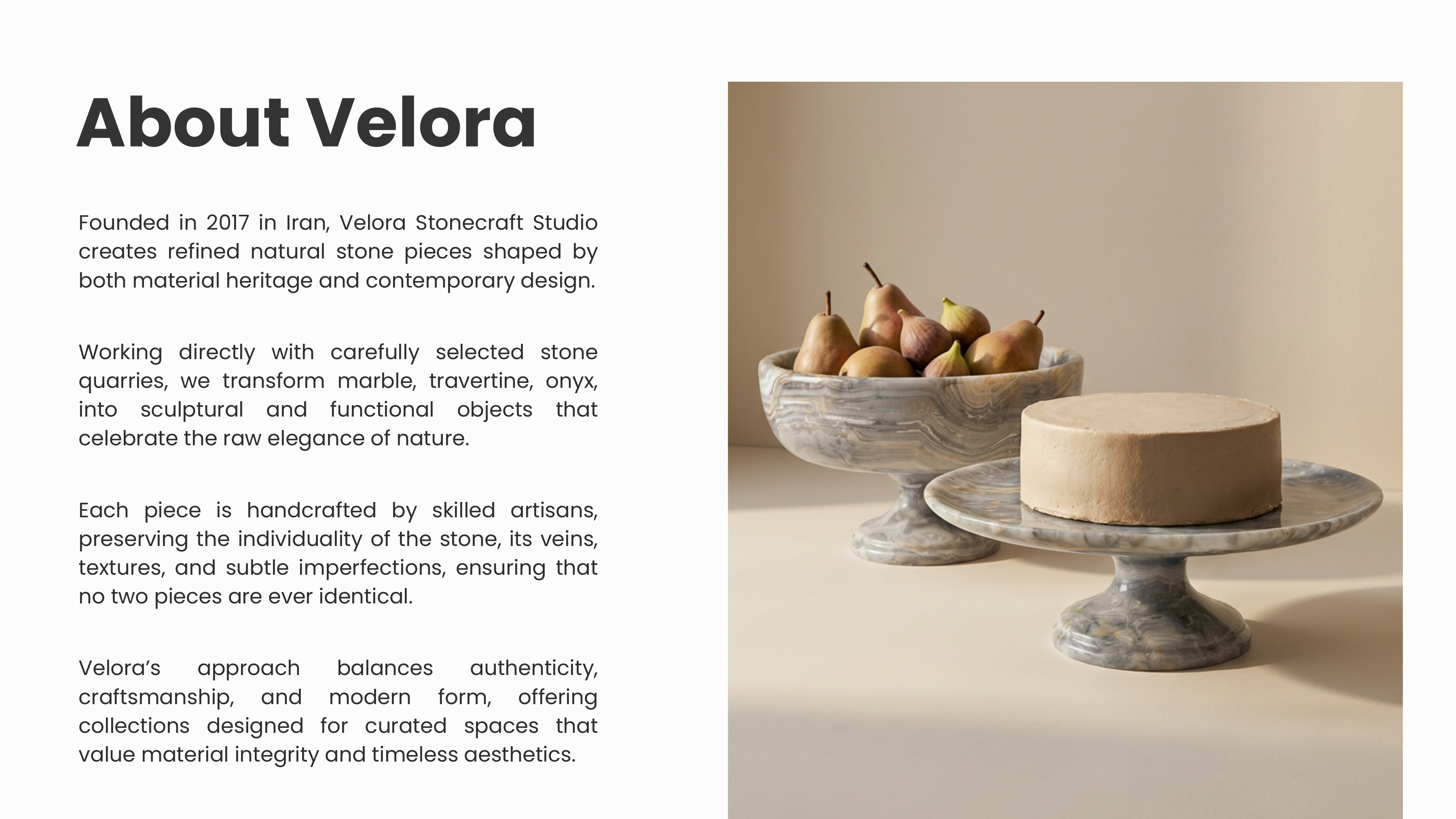
Velora Stonecraft is a luxury stone-sculpture atelier based in Tehran, Iran. The studio creates one-of-a-kind, hand-carved pieces from natural stone — sculptures, tables, tableware, accessories, water sculptures, and lighting fixtures.
Each object is produced through a defined, step-by-step crafting process in their atelier. No two pieces are ever identical. The brand sits at the intersection of functional design and quiet artistry — built for collectors who value permanence, material honesty, and refined minimalism.
Every post, story, and highlight on the Instagram page — from product photography direction to layout and copy — was designed by me.
The Brief
Velora Stonecraft needed a brand system worthy of the craft itself — calm, precise, and timeless. The challenge was to design an identity that:
- Communicates the weight and permanence of natural stone without feeling heavy or cold.
- Sits comfortably on a luxury website, an Instagram feed, and an atelier business card alike.
- Works in two scripts — Latin for international clients and Persian for the local market.
- Lets the product photography lead — the system is a frame, never a distraction.
Brand Values
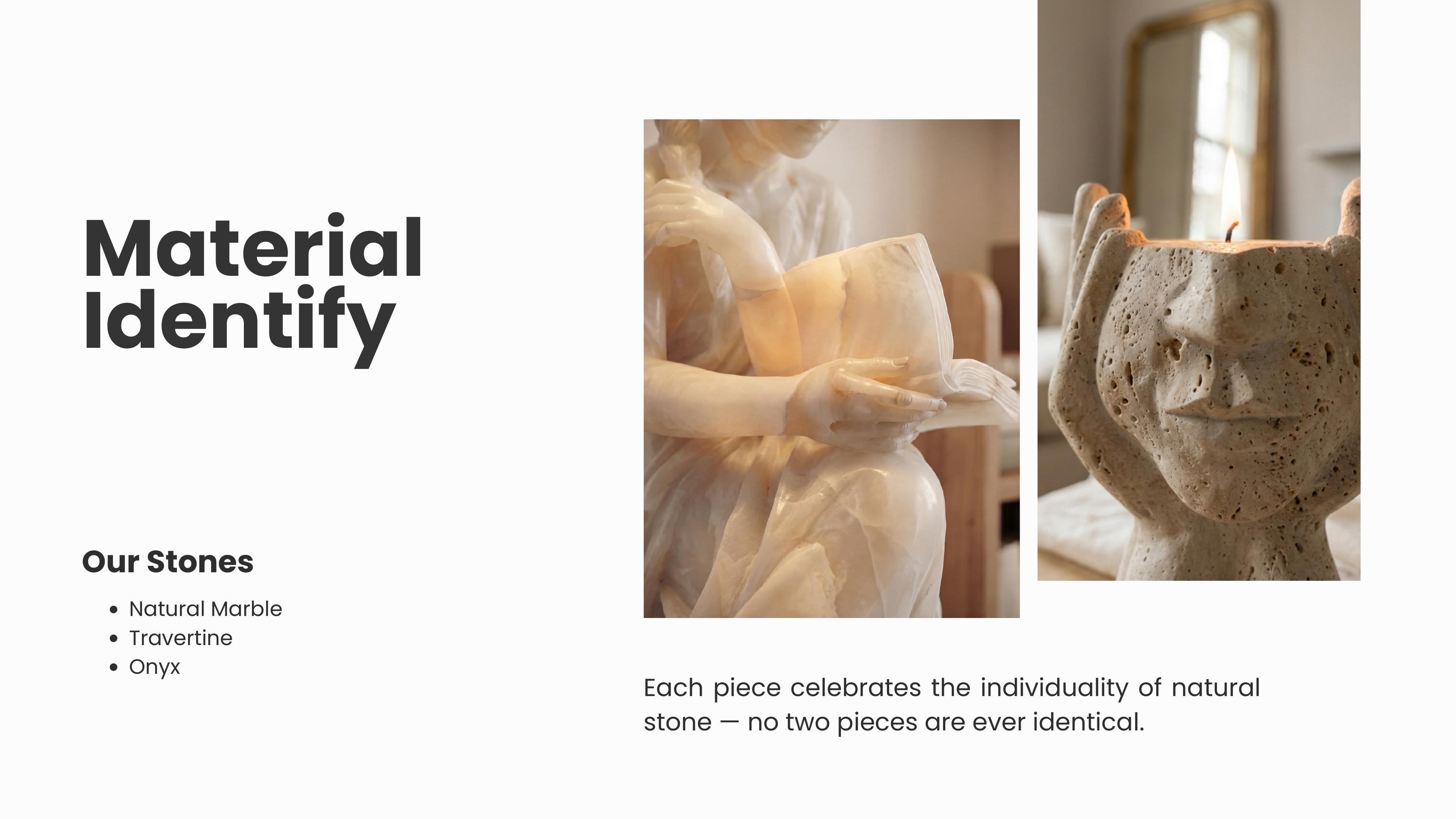
Material Honesty
Natural variations in stone are celebrated, not concealed. The brand language echoes the same restraint.
Quiet Distinction
Refined minimalism without austerity. Confident enough to whisper, never to shout.
Permanence
Stone outlasts trend. The identity is built to age well — typography, marks, and palette designed for decades, not seasons.
Hand-Crafted
Every piece is individually carved. The brand mark is intentionally drawn, not generated — a signature of human touch.
Logo Design
The mark is built around an interlocking VL monogram — the V grounded and geometric, the L rising into a sweeping calligraphic curve. Together they create a single fluid form that is both architectural and handwritten, mirroring the tension between stone's rawness and the atelier's precision.
Below the monogram, "VELORA STONECRAFT" is set in spaced uppercase with a small stone-crystal glyph replacing the O — a quiet material reference that ties the wordmark to the product. "SINCE 2017" anchors it in time.
Exploration
Final Mark
- Primary lockup — full monogram + wordmark for headers, packaging, and print.
- Square lockup — monogram + wordmark stacked for Instagram profile and square formats.
- Monogram only — VL mark alone for embossing, favicons, and small applications.
Color Palette
The palette is drawn directly from the studio's raw materials — pale travertine, warm sandstone, deep basalt, and the soft greys of cured concrete. Neutrals do the heavy lifting; a single warm accent provides depth without competing with product photography.
Typography
A two-typeface system pairs a contemporary serif for display with a clean geometric sans for UI and body. The serif gives editorial gravitas; the sans keeps long-form content effortless to read.
Display / Headlines
Velora
Fraunces — Variable serif
Weights: 400 / 700 · Italic supported
Used at 32px+ for editorial impact.
Body / UI
Stonecraft
Inter — Geometric sans
Weights: 400 / 500 / 600 / 700
Used 14–18px for paragraphs and UI labels.
Visual Language
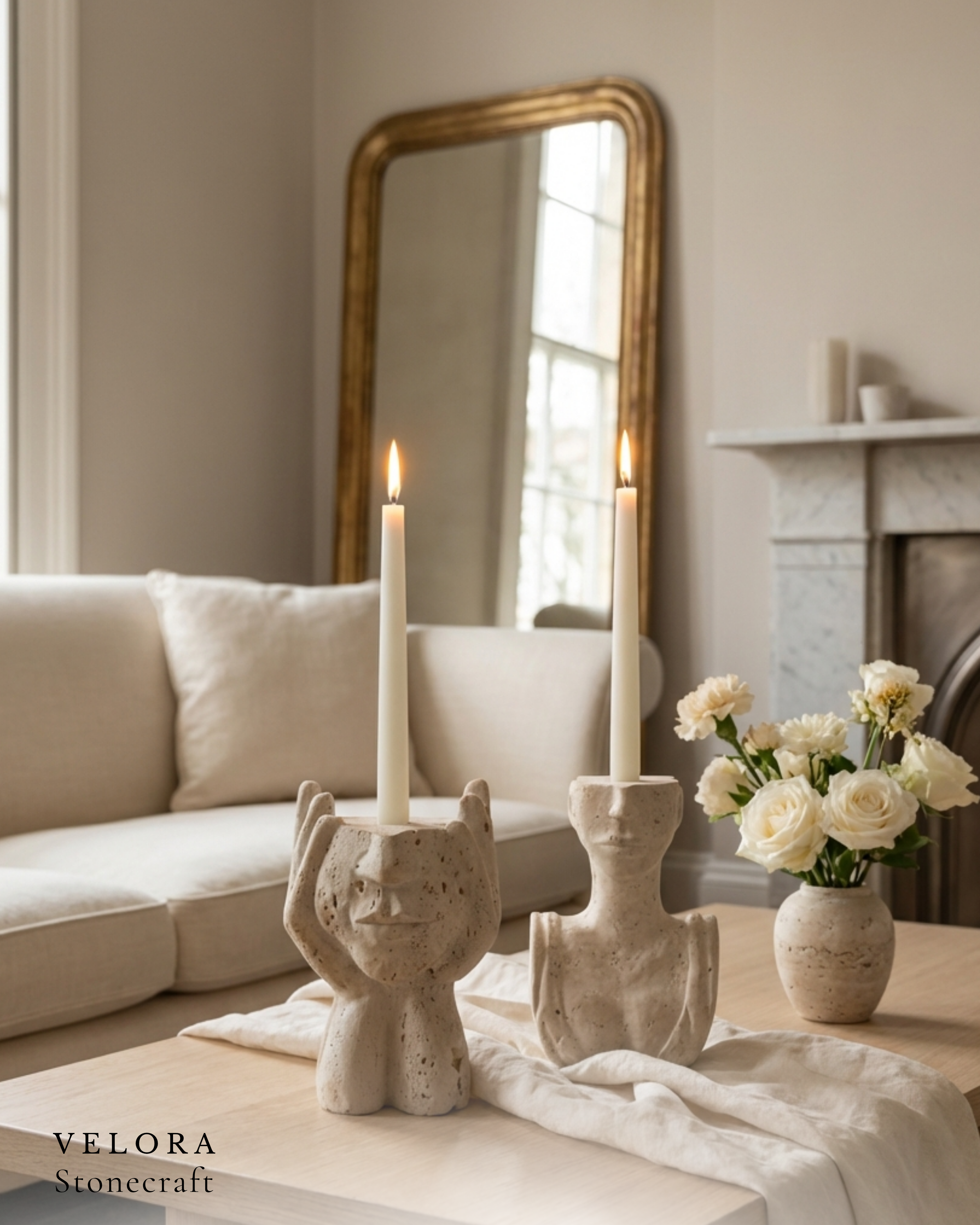
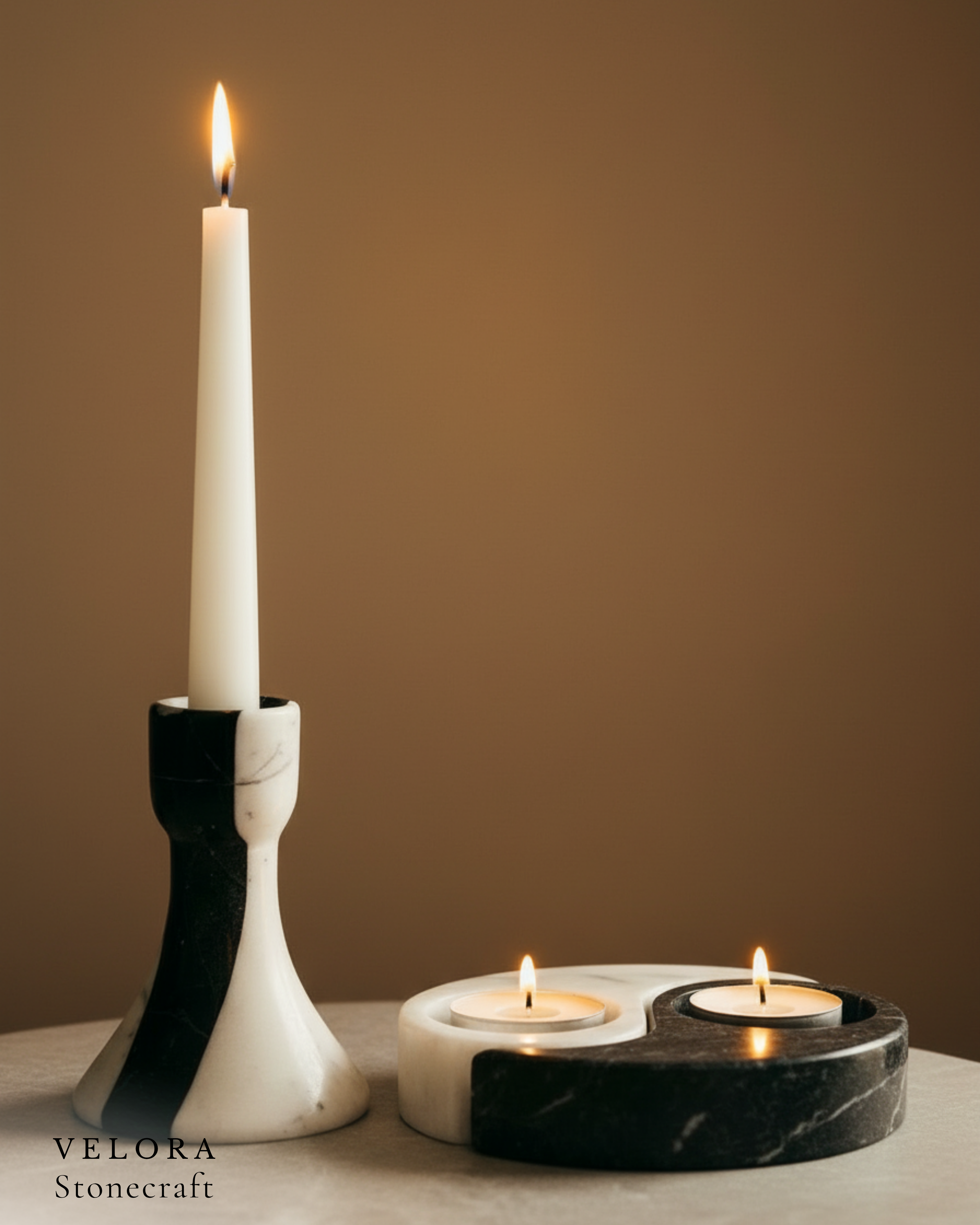
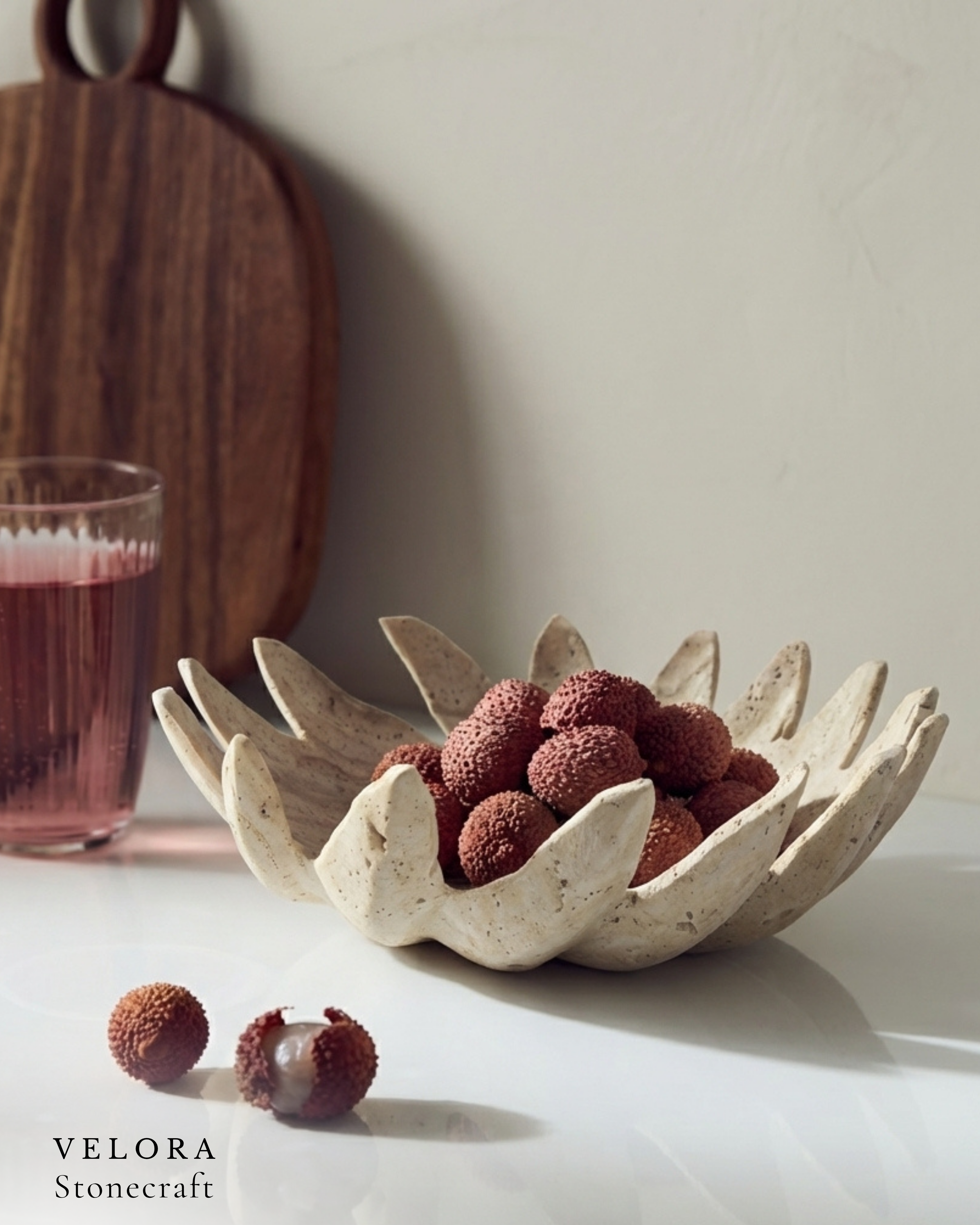
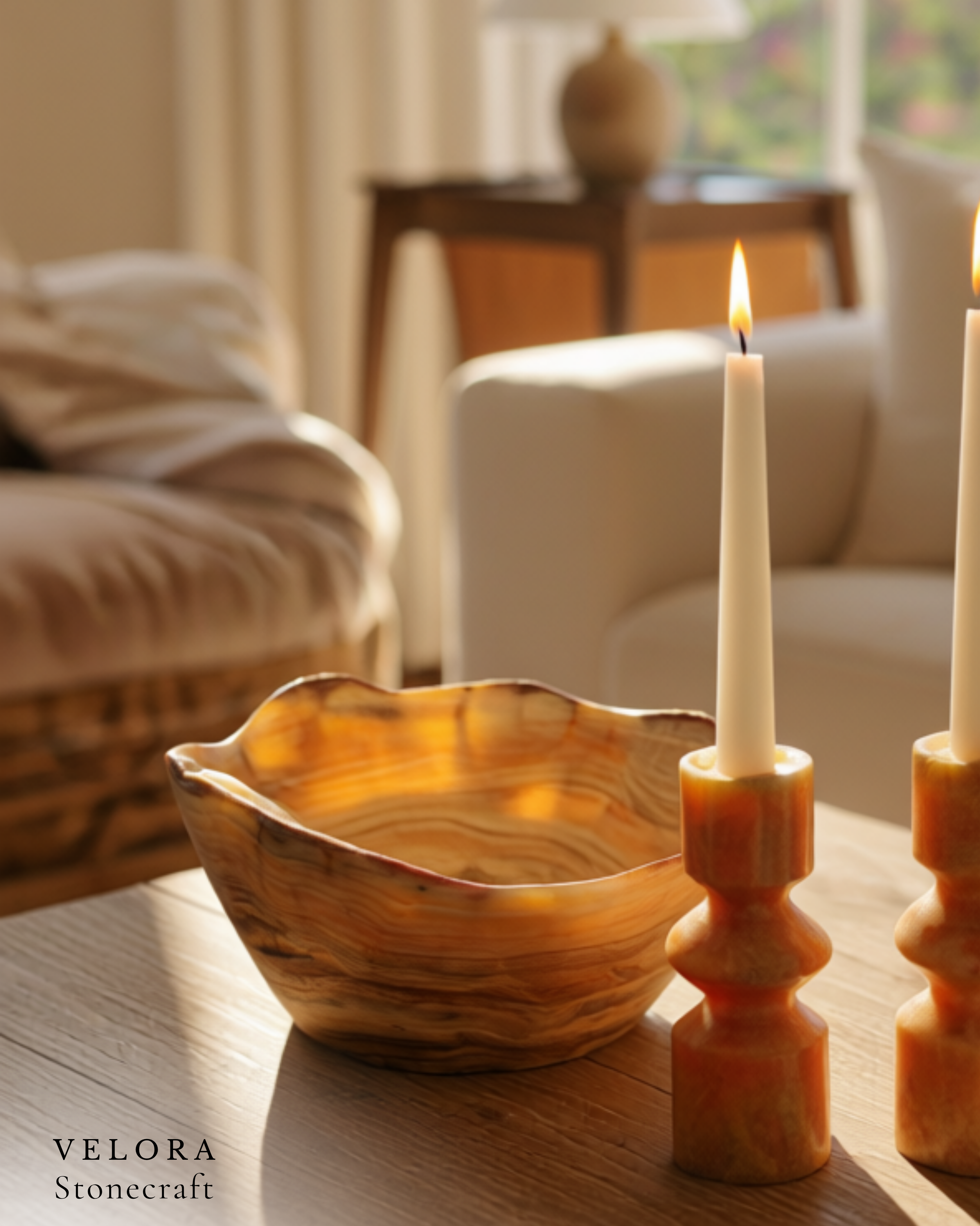
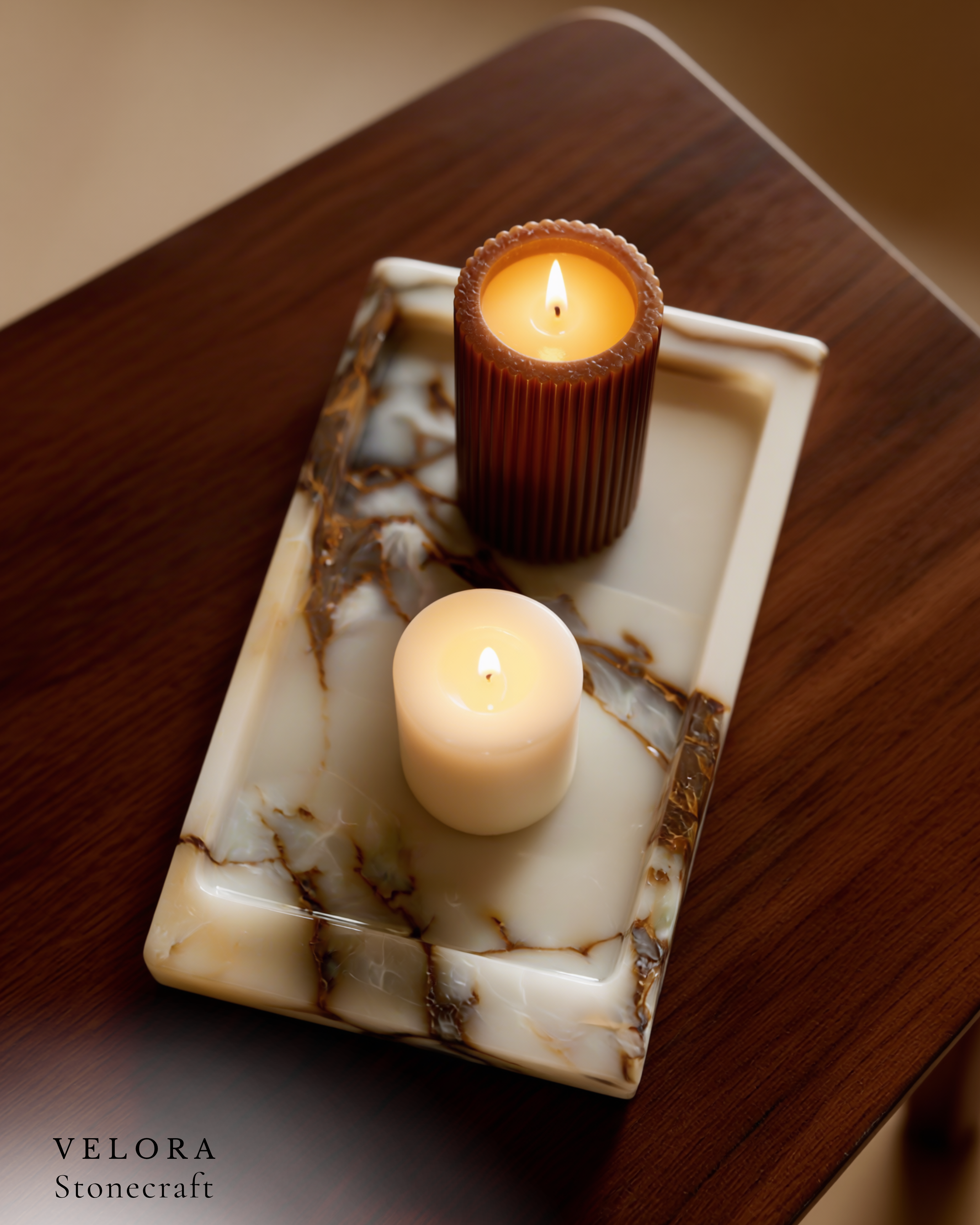
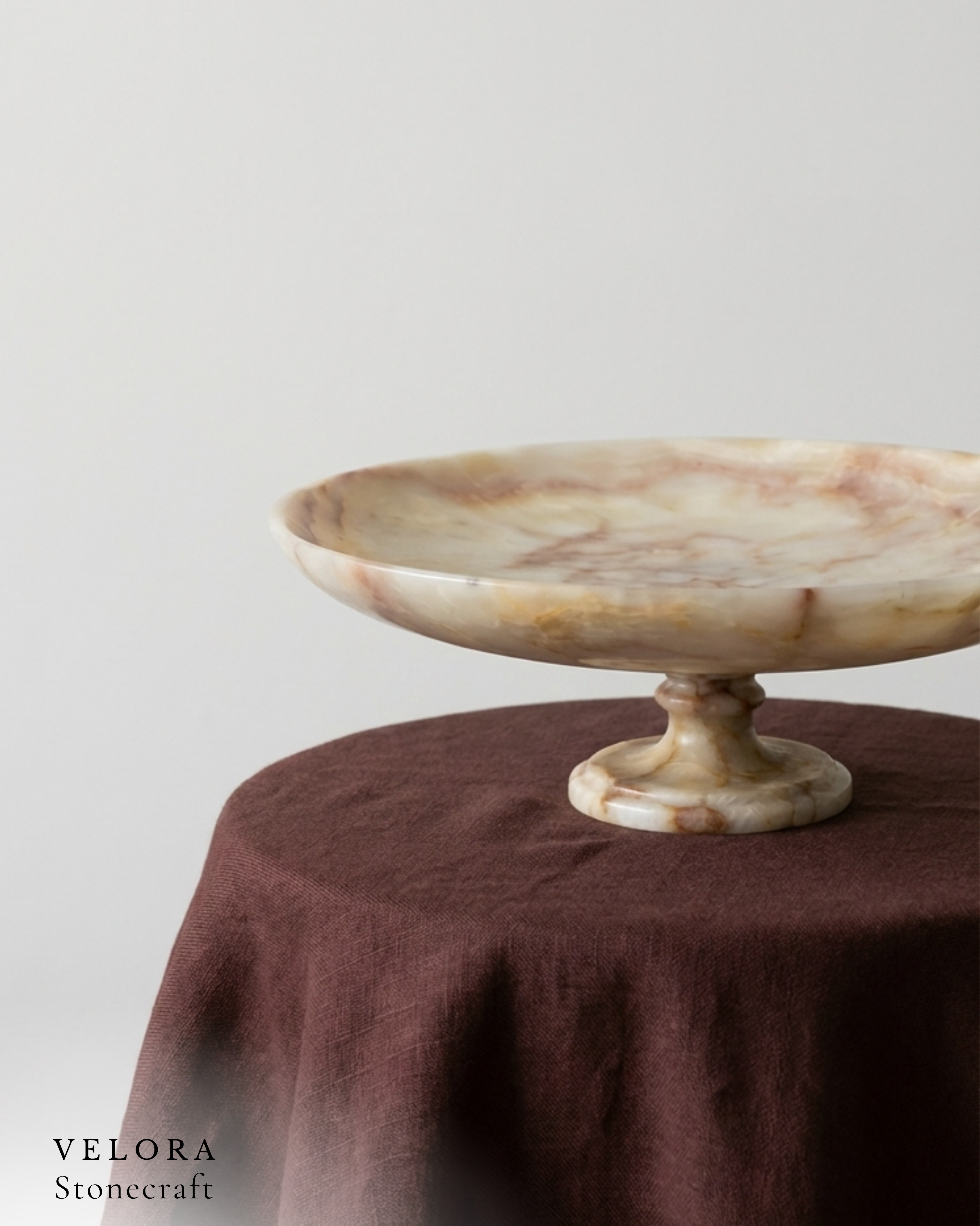
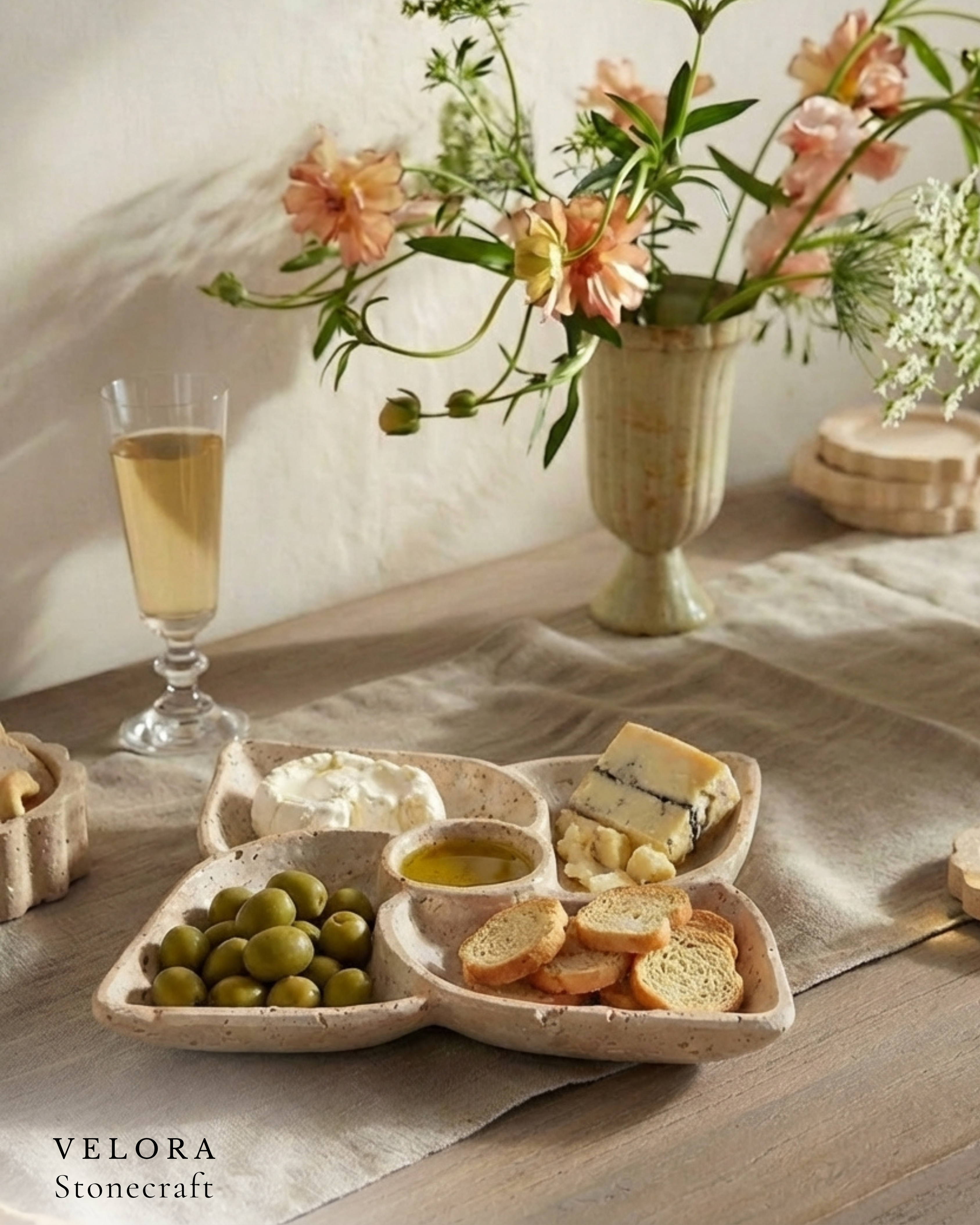
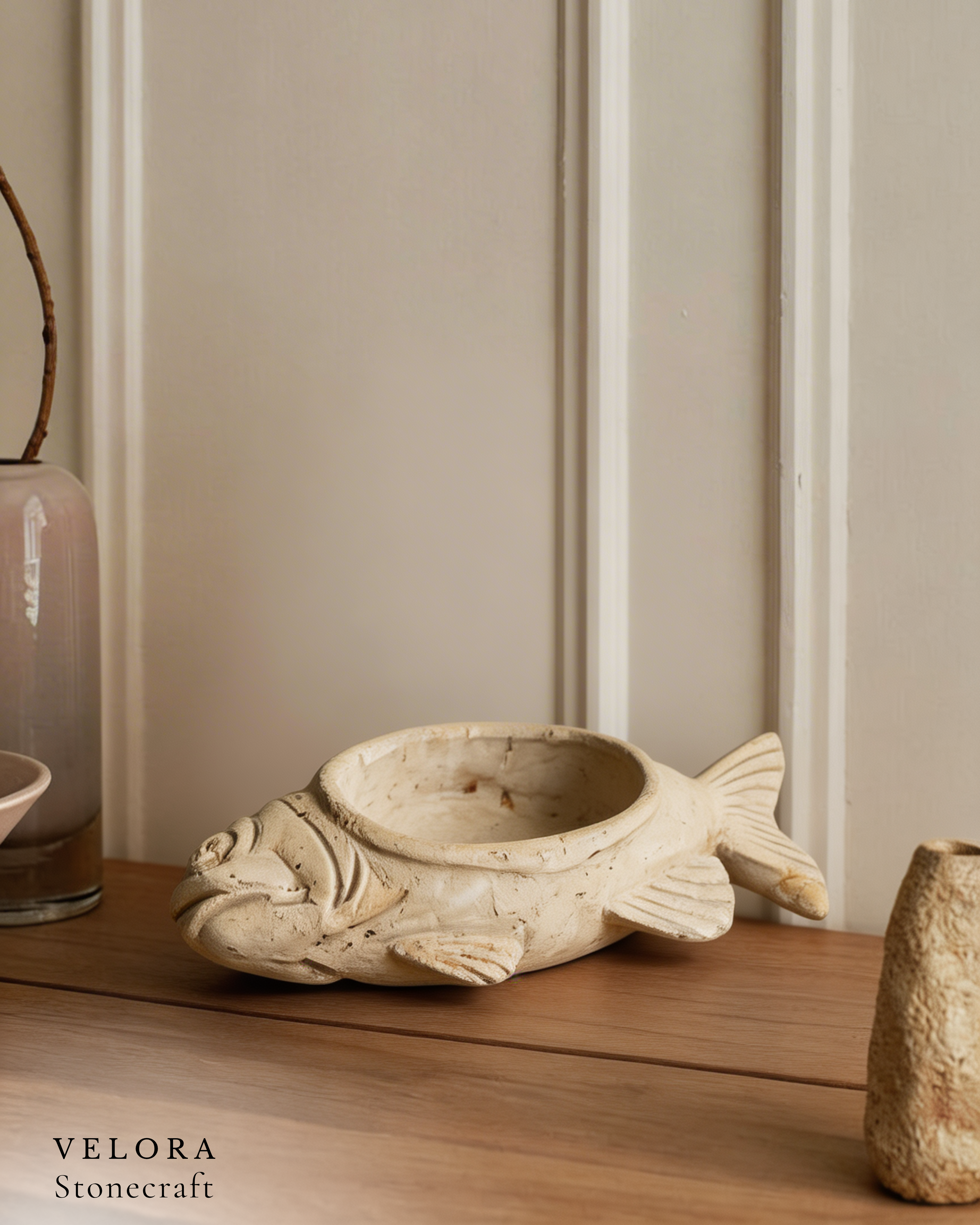
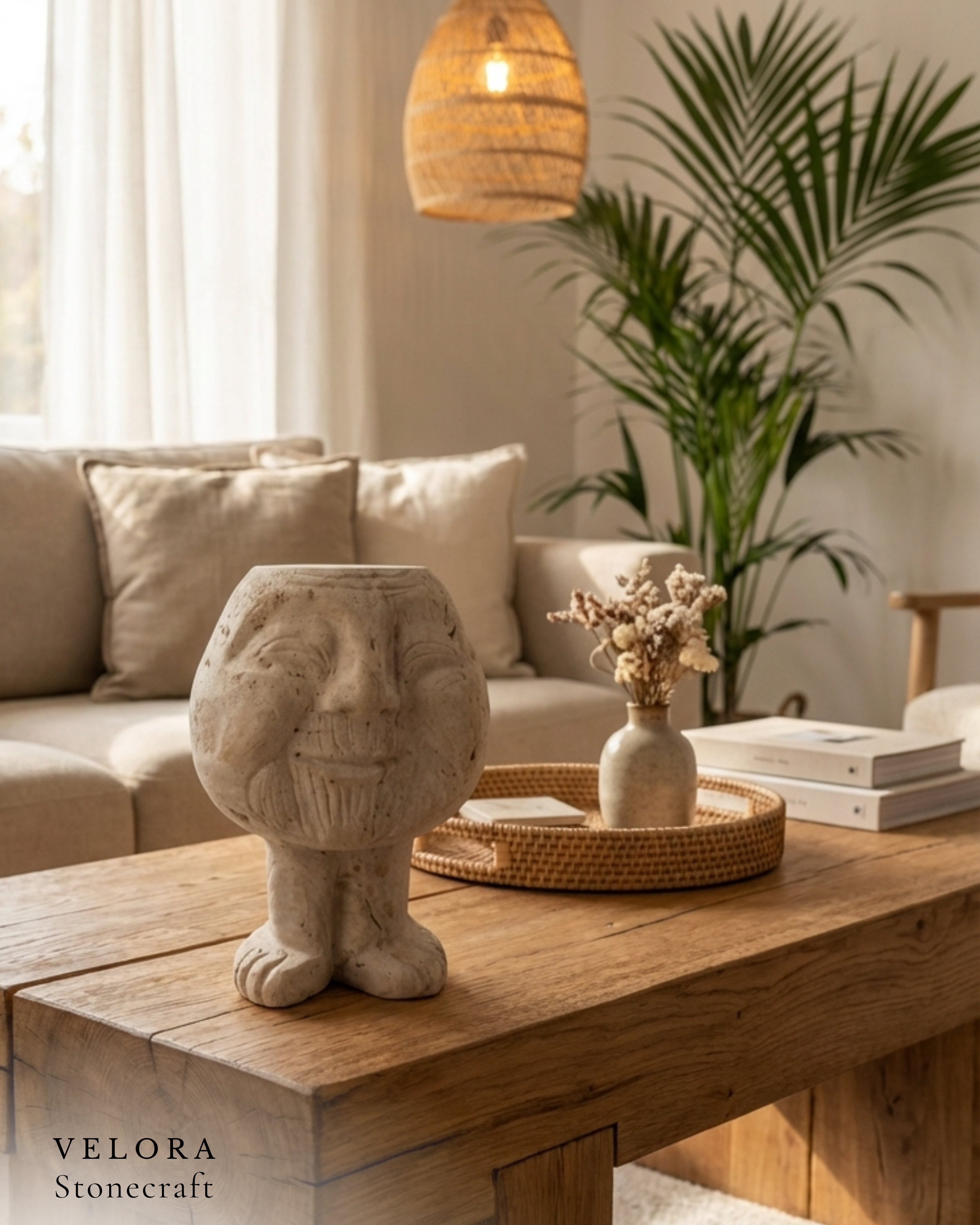
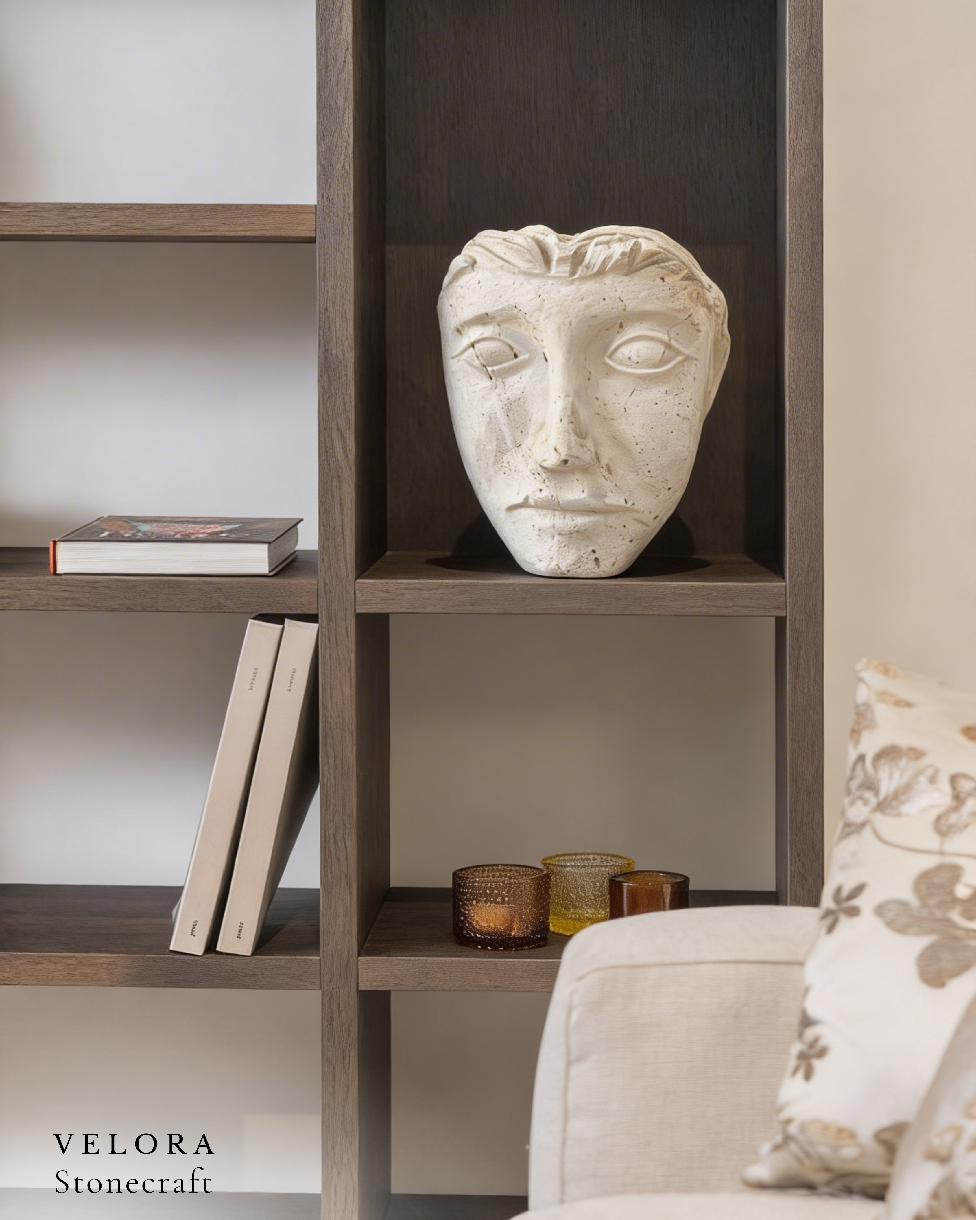
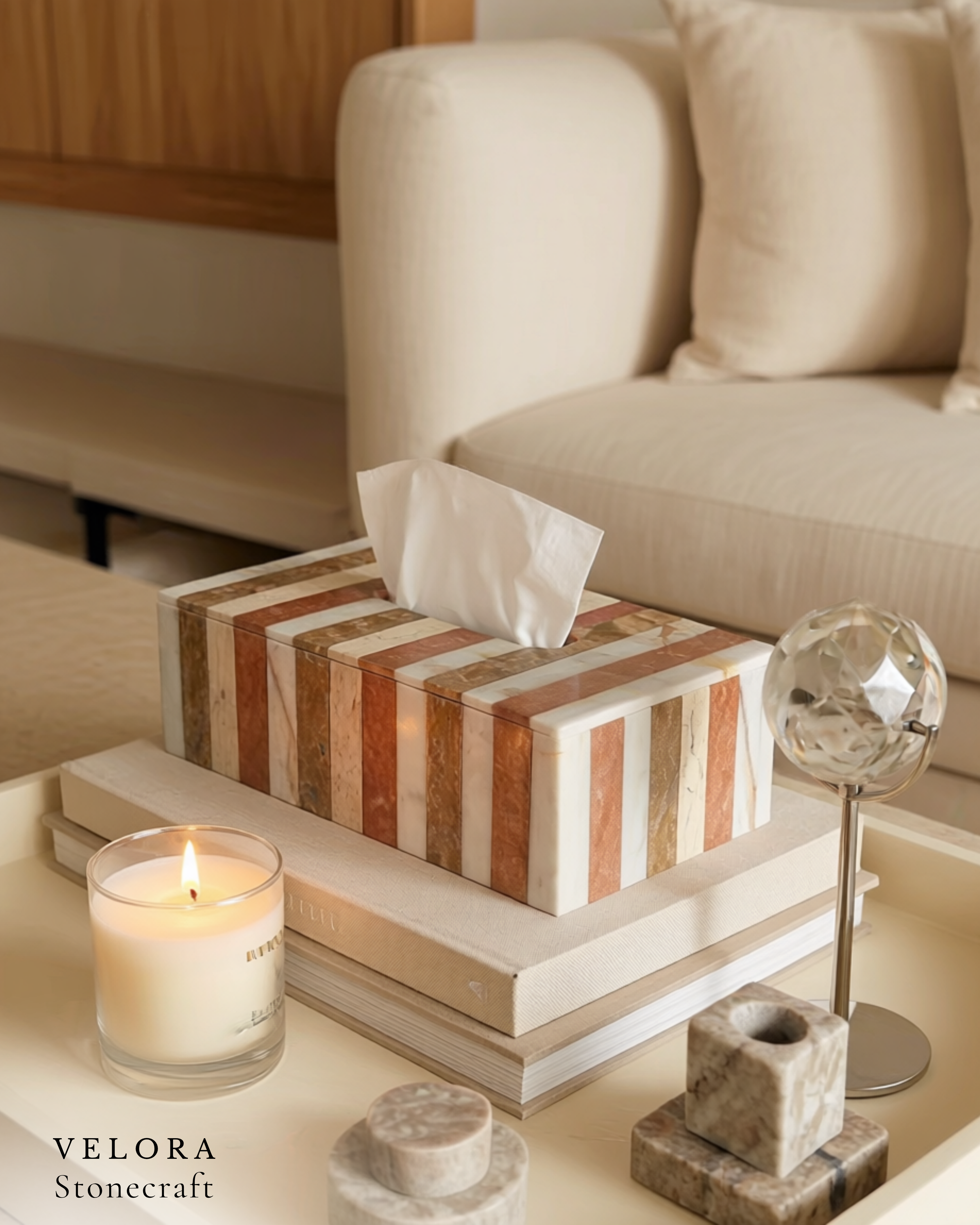
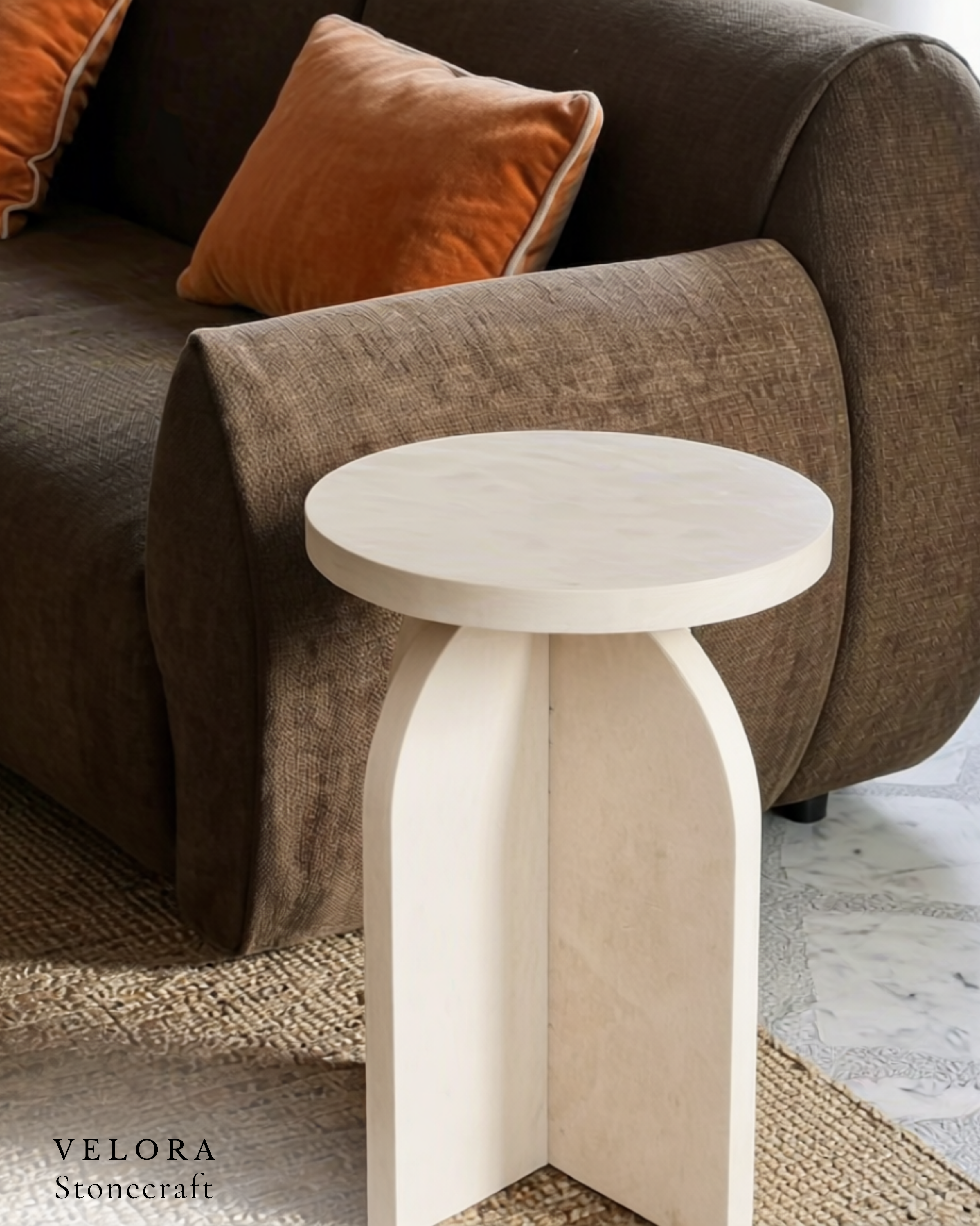
Photography direction is the soul of the brand. Three art-direction rules guide every shot:
- Single-subject framing — one piece per composition, breathing room around it.
- Natural light only — no harsh studio flash; soft directional light to reveal stone texture.
- Architectural backdrops — pieces shot in their intended habitat: stone walls, raw plaster, natural wood.
Layout rhythm follows the same restraint: generous whitespace, large product imagery, short captions. The grid breathes — it never crowds the work.
Product Categories
The brand system structures six product lines — each with consistent typography, image treatment, and copy voice:
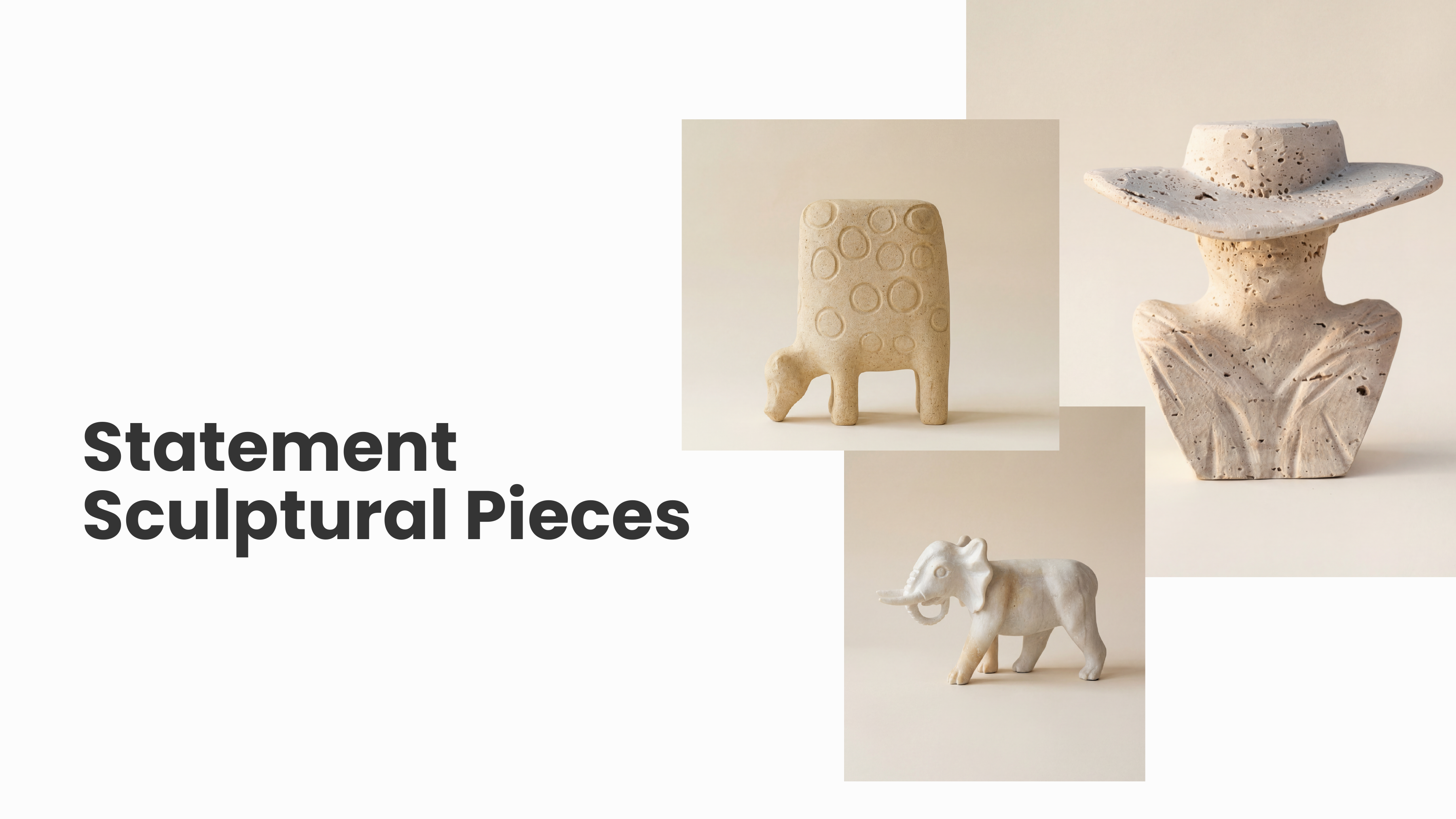
Sculpture
Hand-carved one-of-a-kind pieces. Limited or bespoke commissions.
Table
Solid-stone tables where function meets sculptural presence.
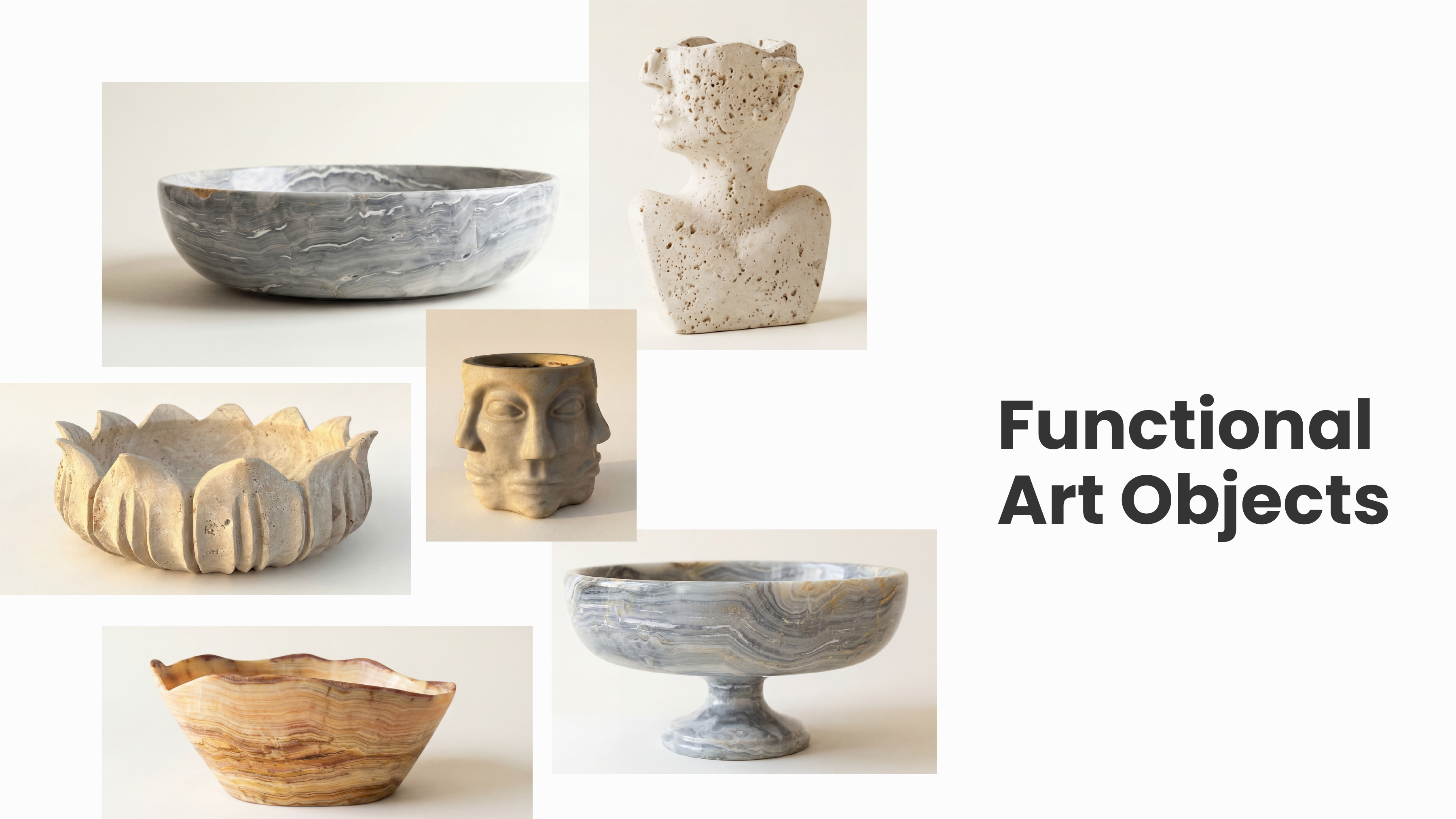
Tableware
Hand-carved bowls and serveware for daily ritual and refined settings.
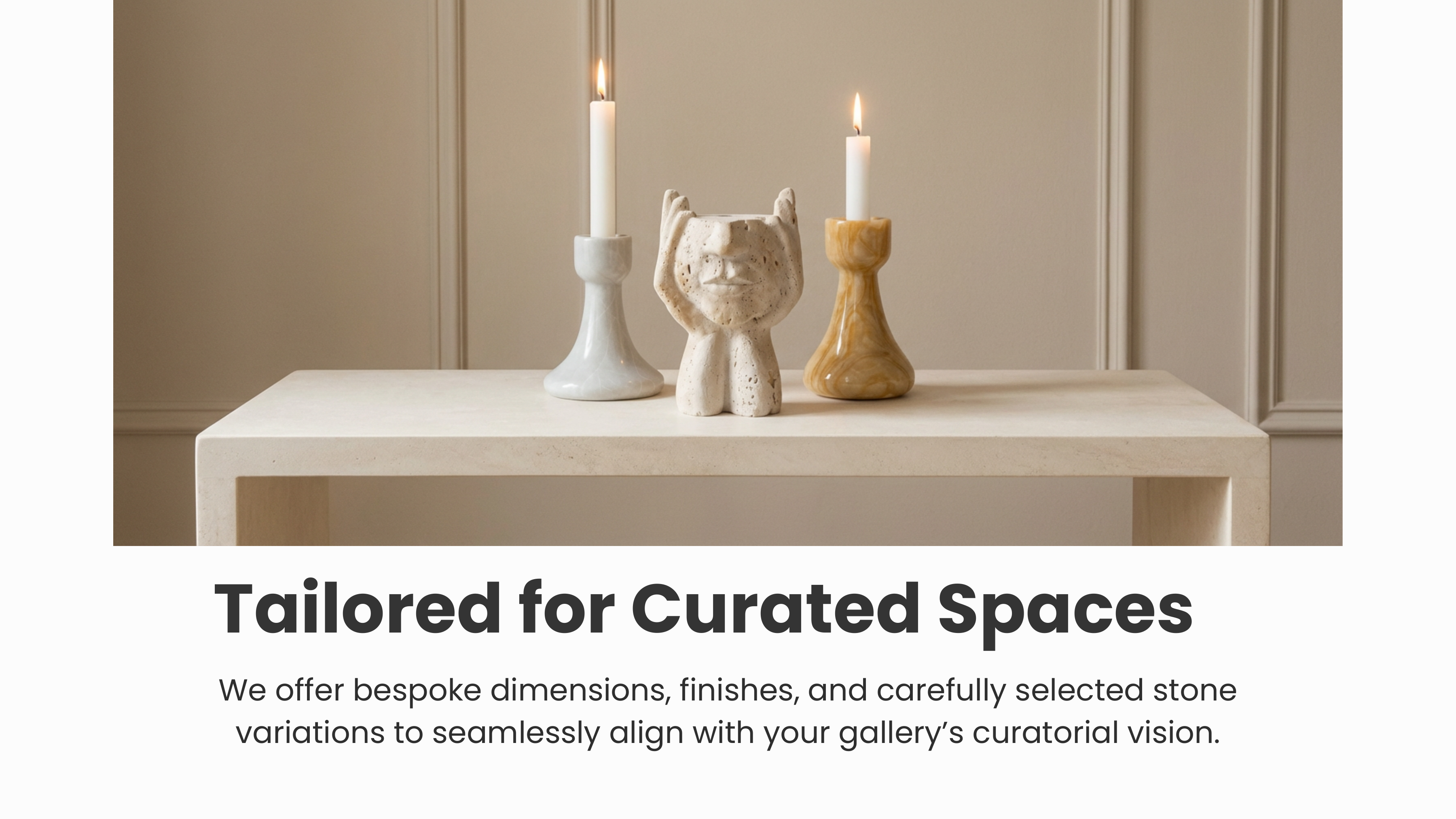
Accessories
Subtle, meaningful objects that complete a space.
Water Sculpture
Living elements bringing movement, sound, and stillness together.
Lighting
Stone meets light — quiet sources of atmosphere that define mood.
Voice & Tone
Brand Voice
"Calm. Considered. Confident enough to whisper. The voice never explains what the stone already says."
Copy is short and sensory. We avoid superlatives ("the best", "the finest") in favour of grounded, material-driven language: "hand-carved," "quiet refinement," "subtle variations," "calm balance."
Applications
The brand system was applied across the full digital and physical touchpoints:
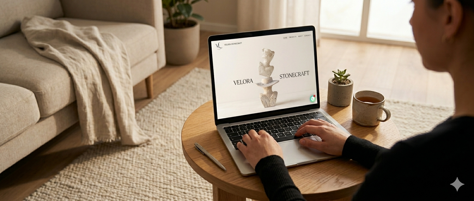
- Website — full e-commerce site at velorastonecraft.com with product catalogue, custom-order workflow, and atelier story.
- Social media — Instagram template system (@velora.stonecraft) for product reveals, process clips, and atelier moments.
- Photography direction — art-direction guidelines for product, process, and lifestyle imagery.
- Print collateral — business cards, packaging tissue, and certificate of authenticity for bespoke commissions.
- Email signatures & correspondence — typographic system applied to client-facing communications.
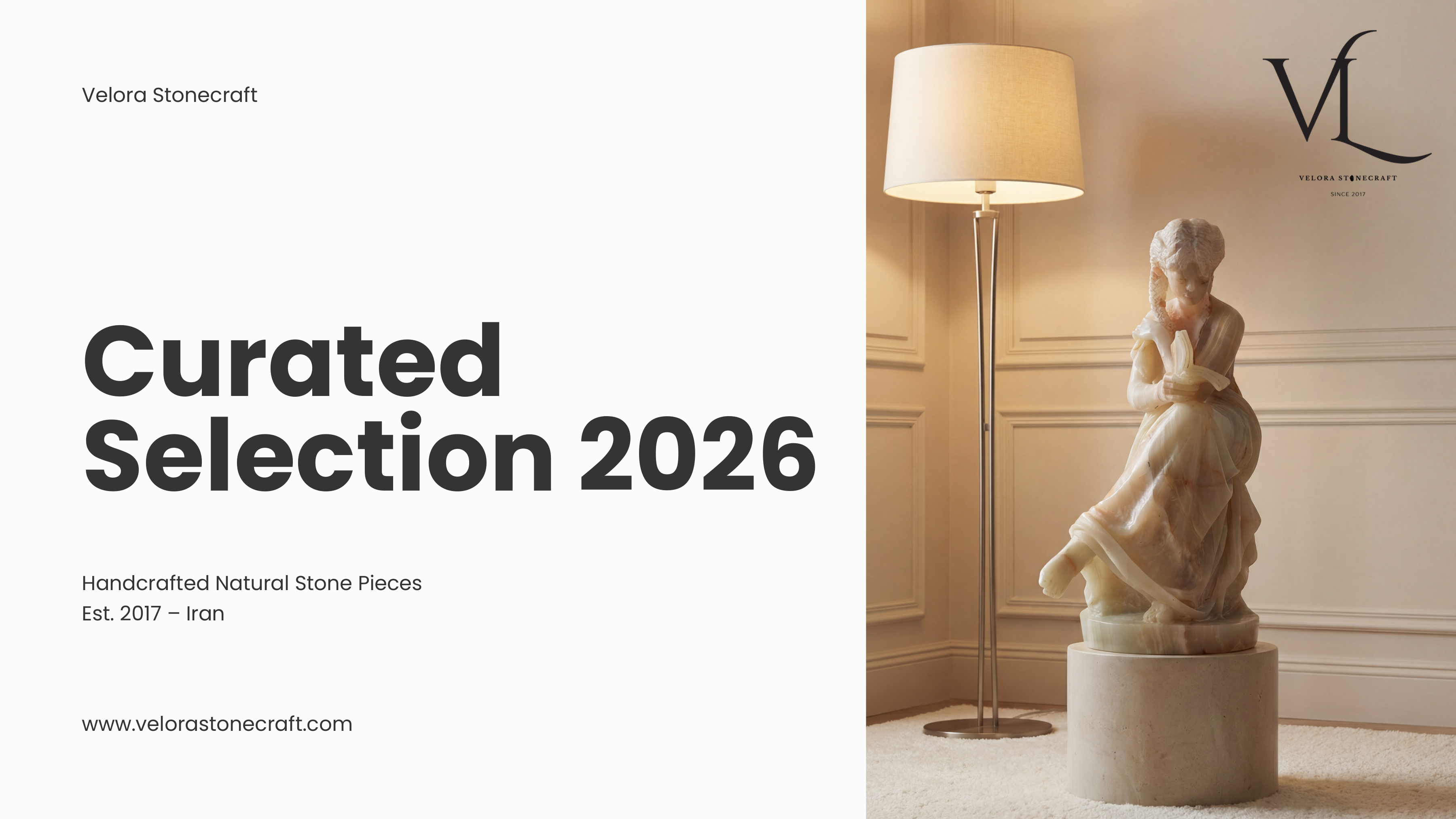
Brand Catalogue — Curated Selection 2026
The brand system applied across an eight-page editorial catalogue — sent to gallerists, collectors, and prospective commission clients. Each spread uses the same restraint: generous whitespace, the studio's serif & sans pairing, and full-bleed product imagery against soft, architectural light.
All product imagery in this catalogue is AI-generated by me
Every photograph below was conceptualised, prompted, and refined using AI image-generation tools — then art-directed into the printed catalogue using Velora's established visual system. This let us scope and present the full collection before any physical photoshoot was commissioned.
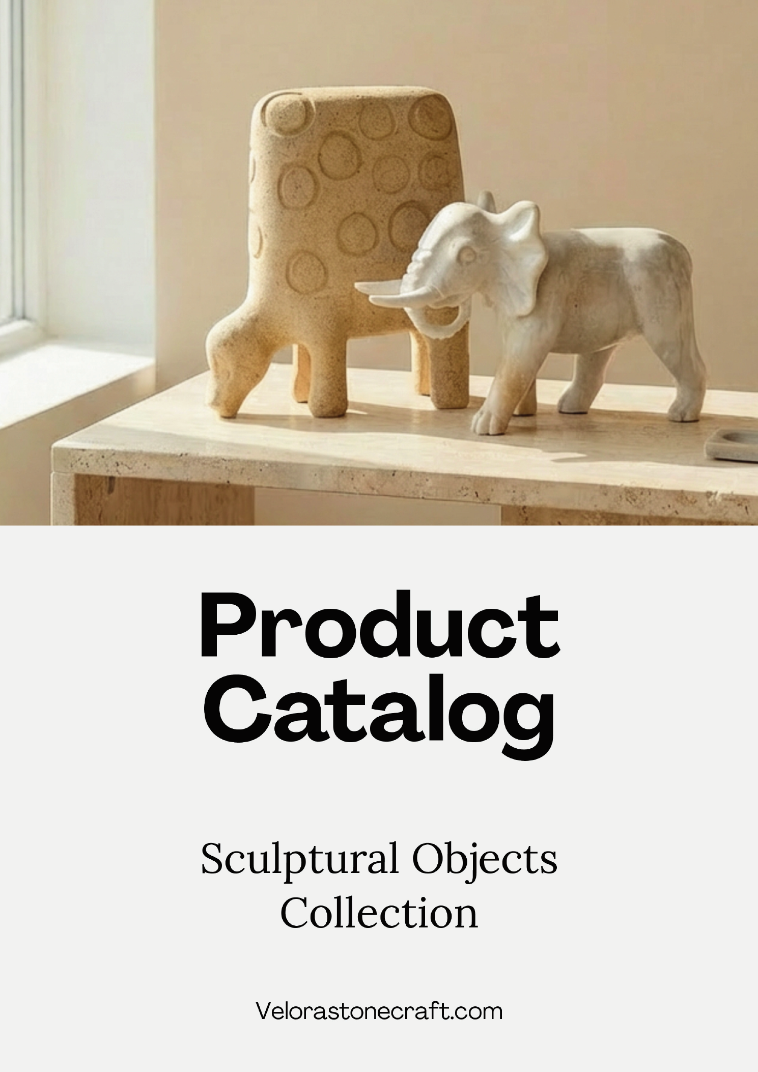
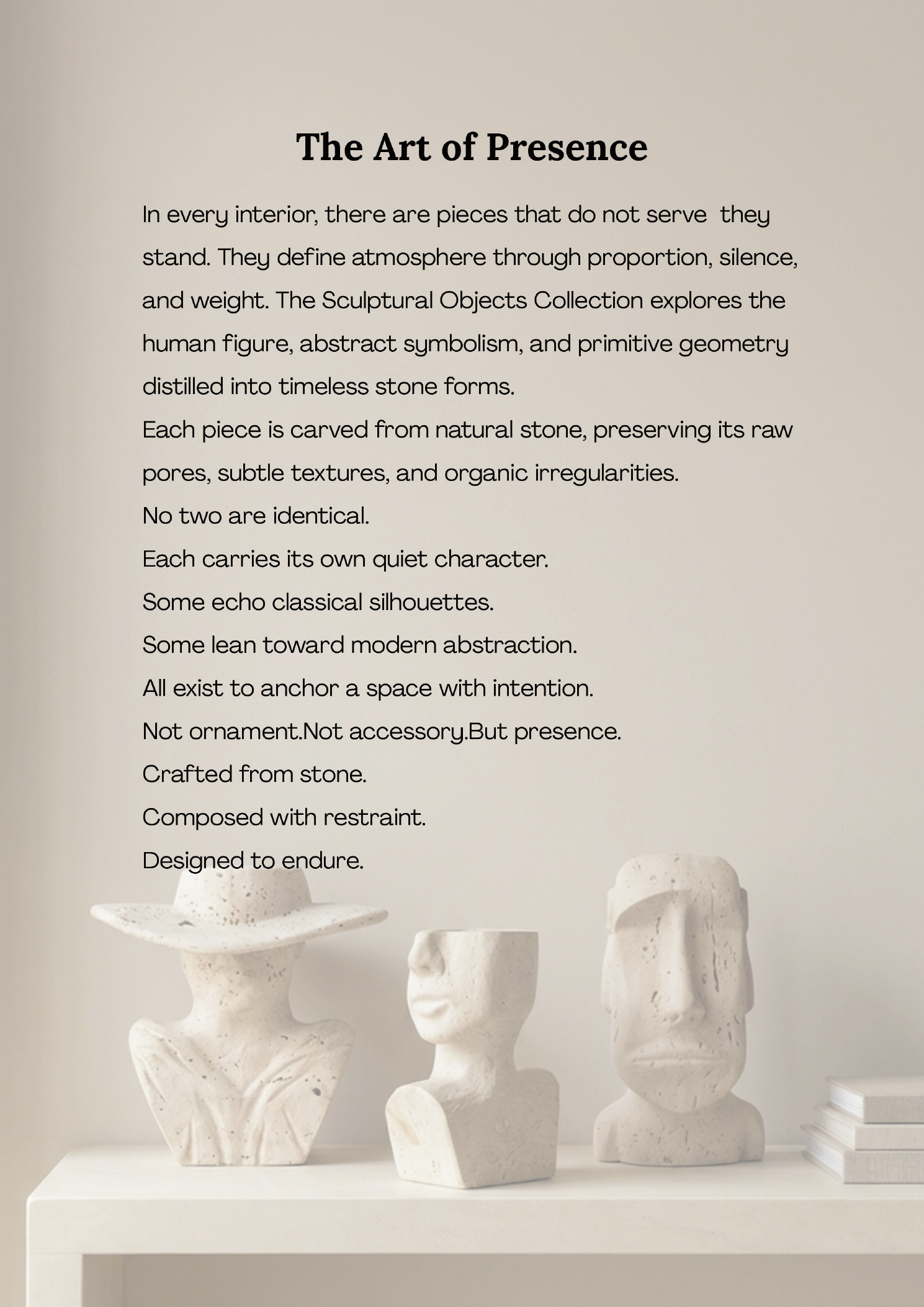
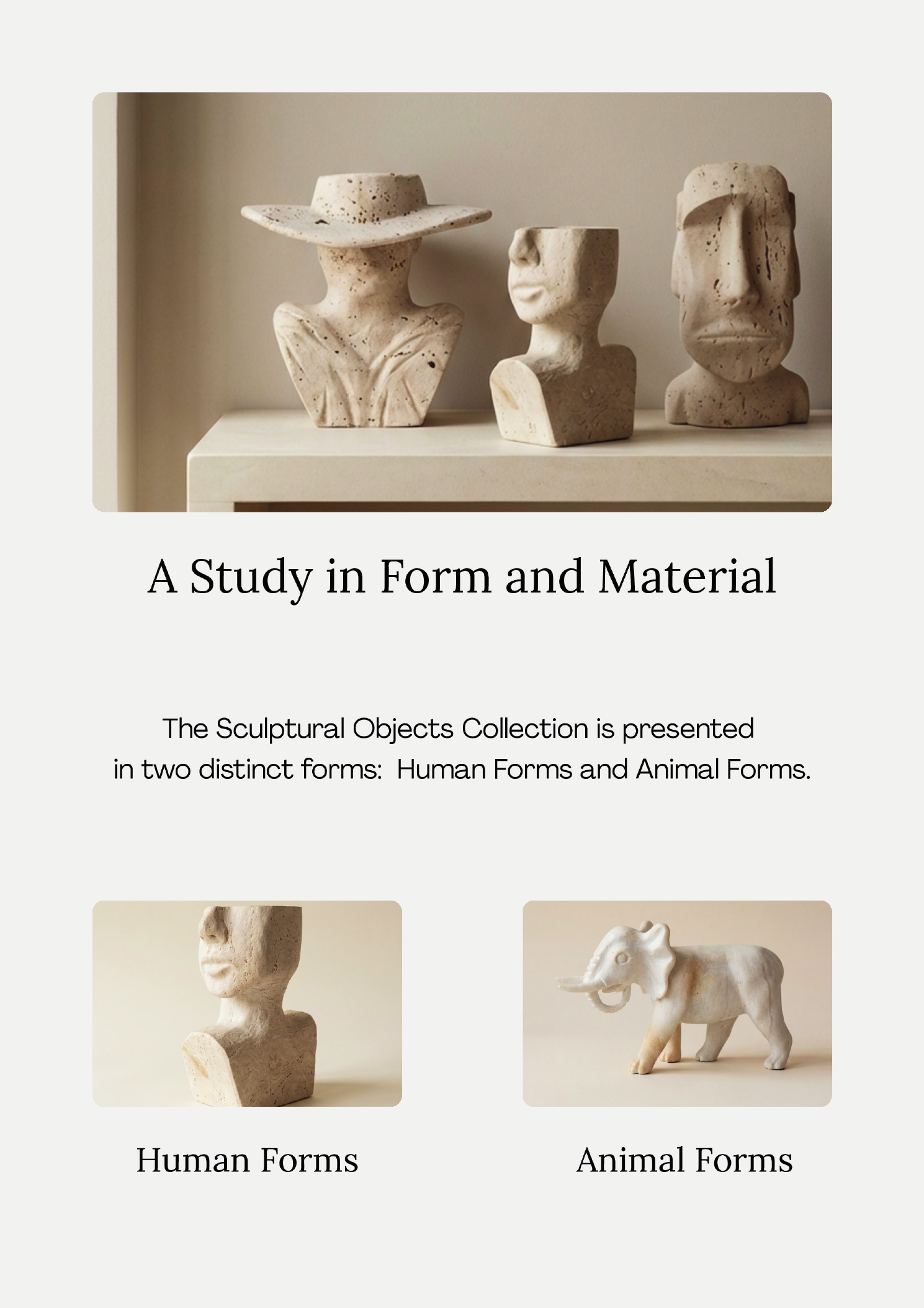
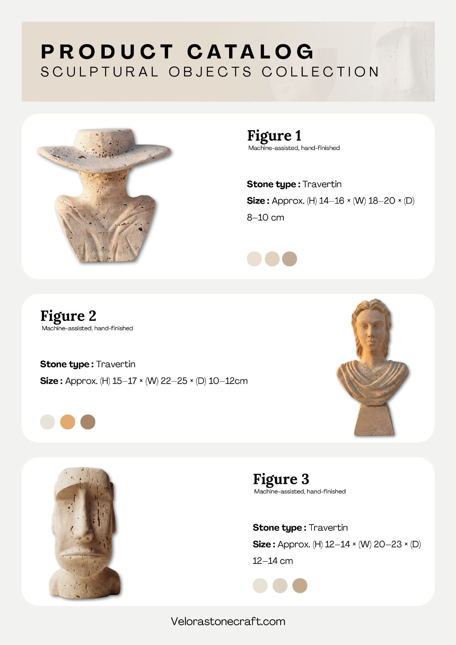
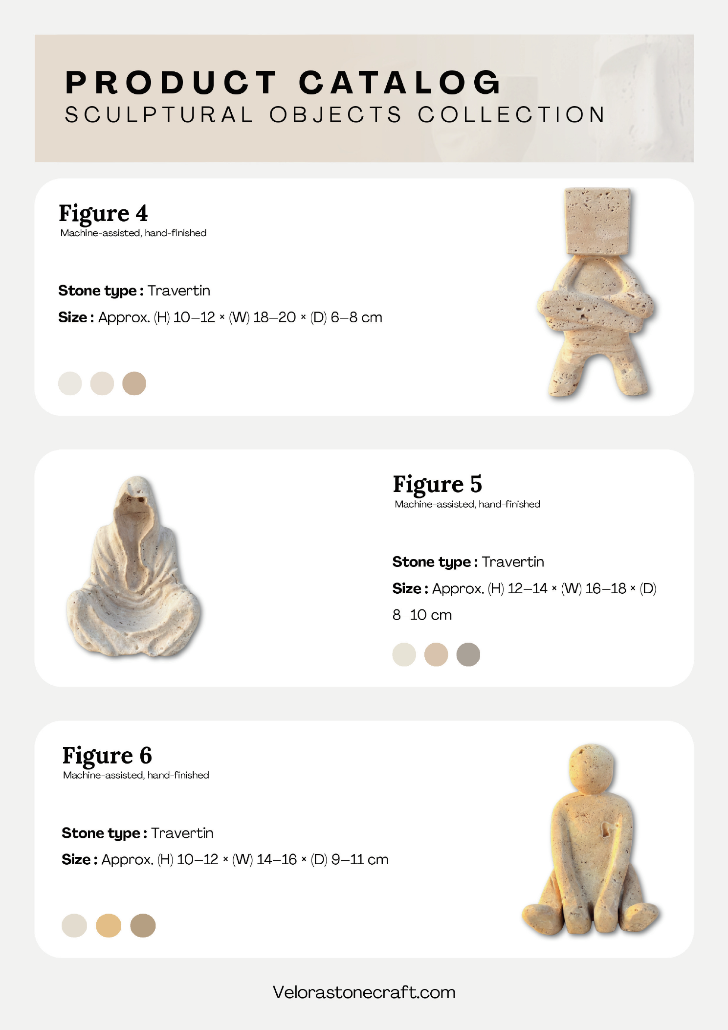
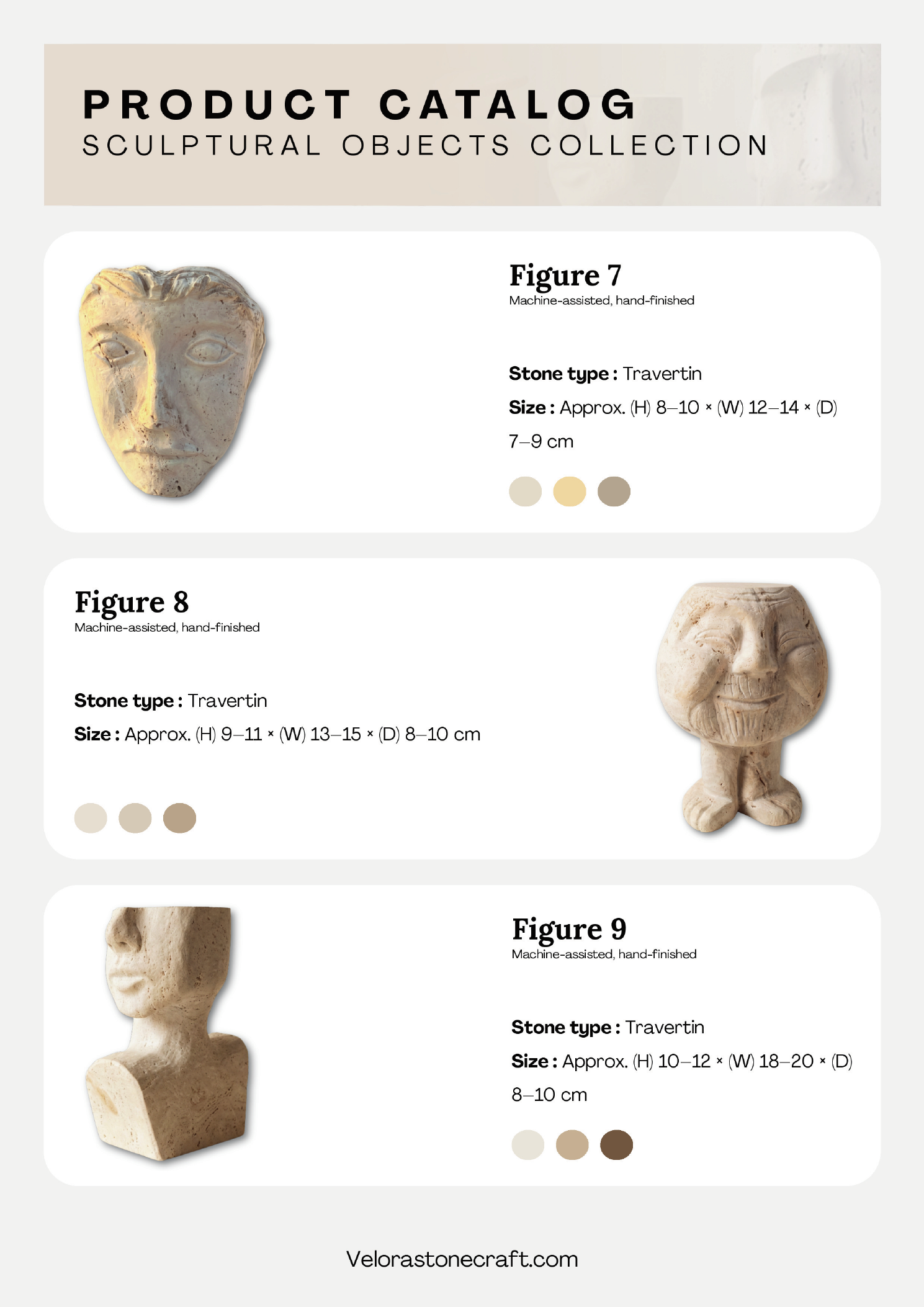
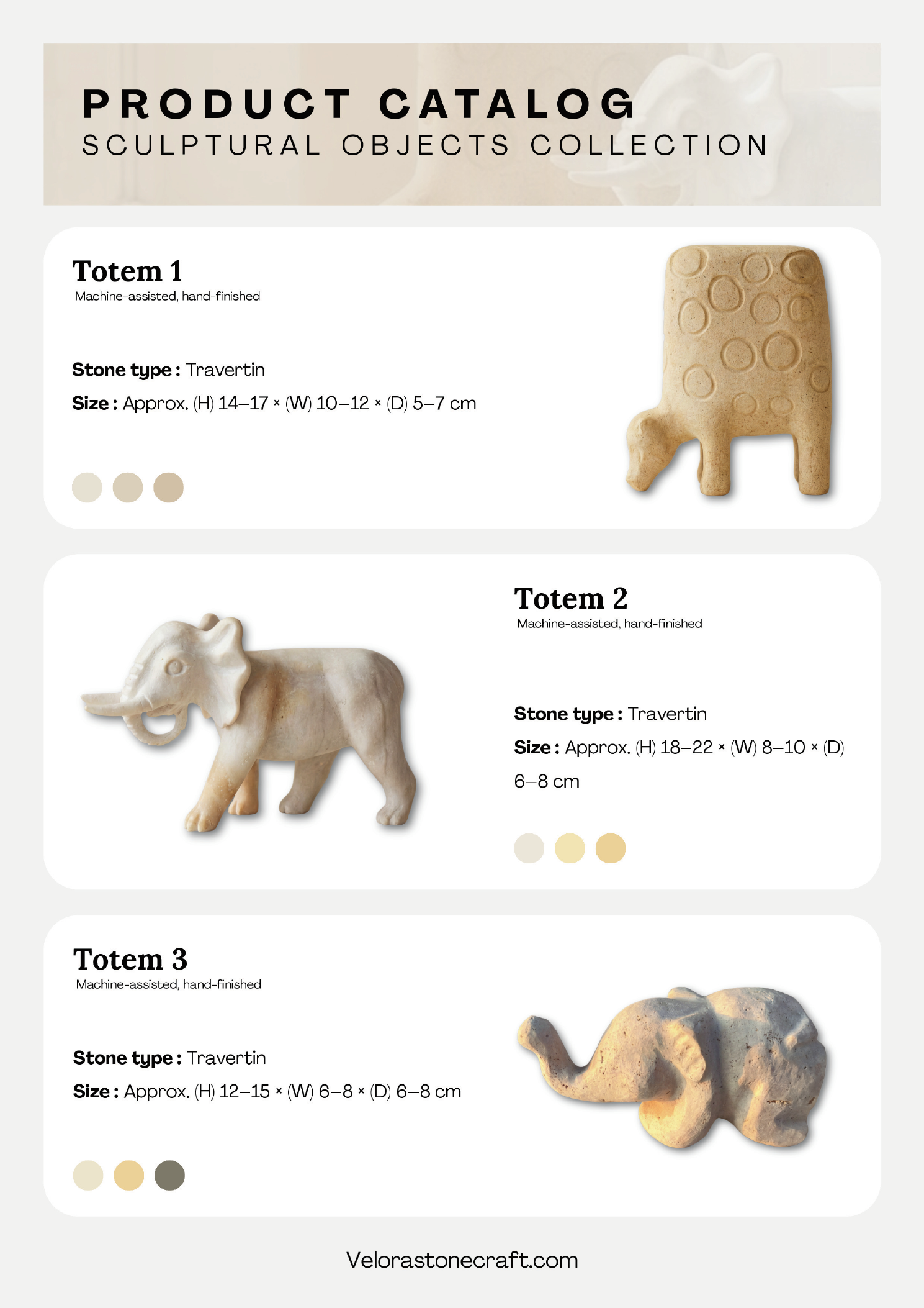
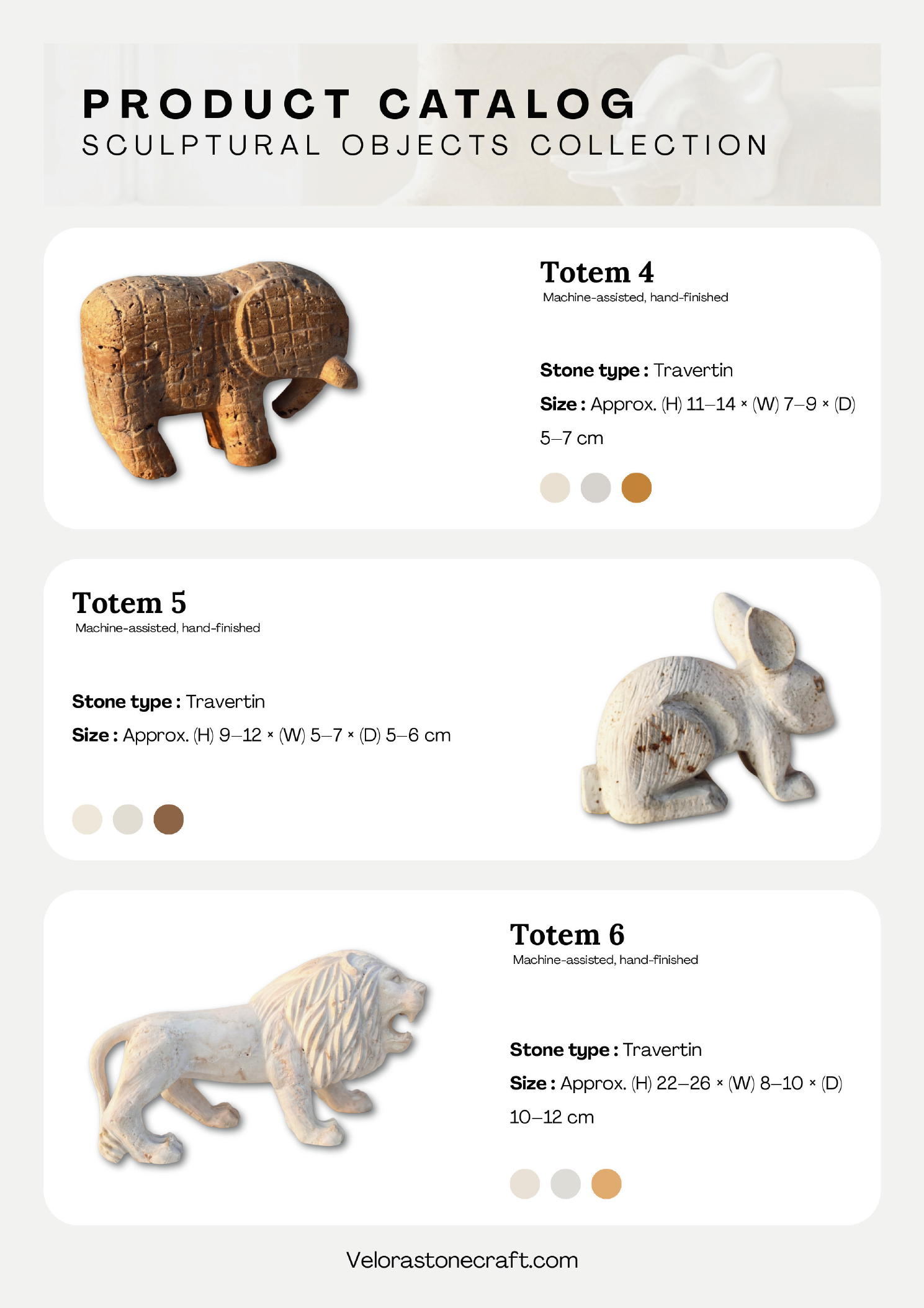
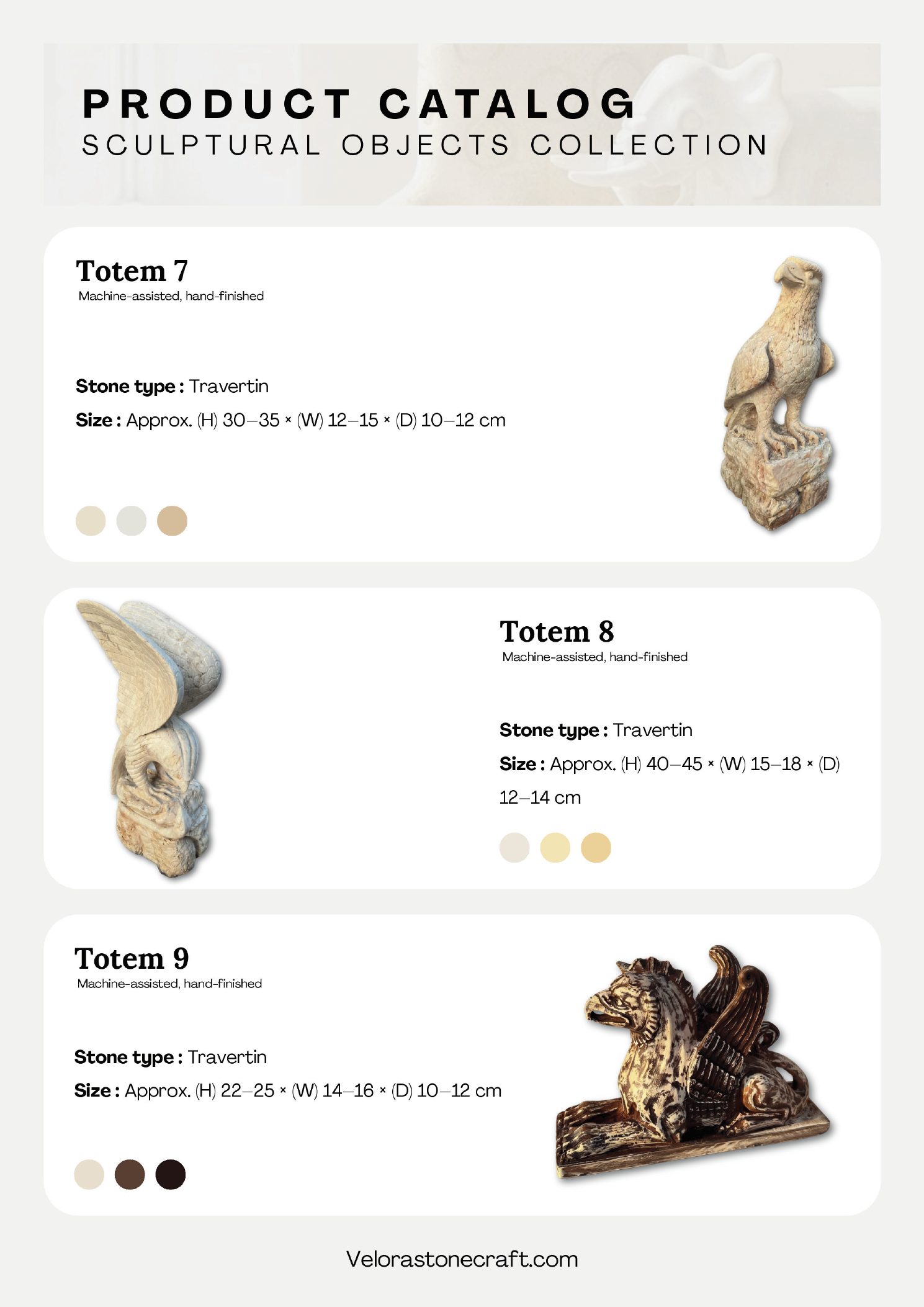
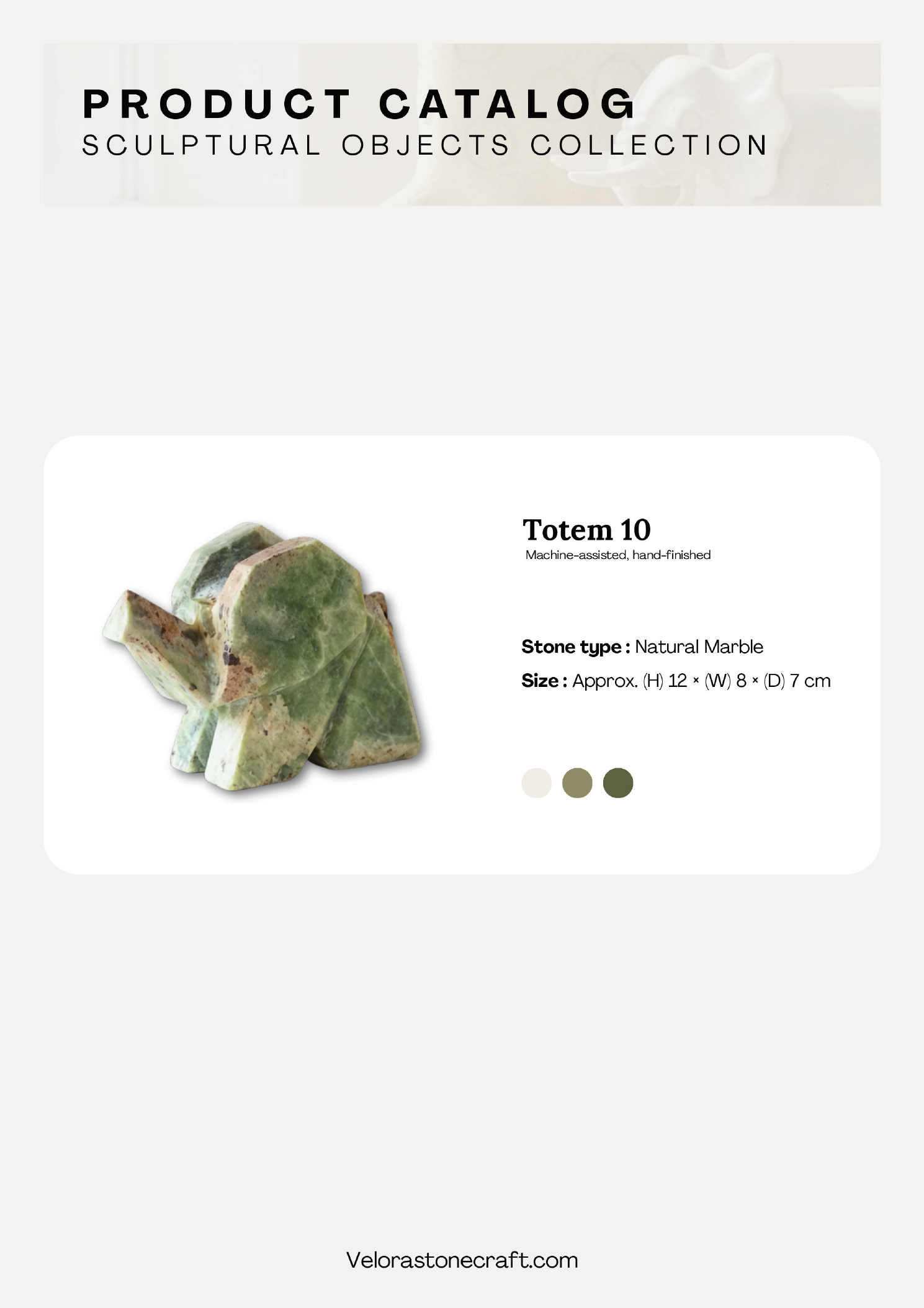
Product Catalogue — Sculptural Objects Collection
A dedicated product catalogue designed for B2B buyers, gallerists, and wholesale clients — presenting the full Sculptural Objects Collection across two categories: Human Forms and Animal Forms. Each spread follows the brand's editorial restraint: warm off-white grounds, alternating product-card layouts, and colour swatches drawn from the stone's natural tonal range.
The catalogue opens with an editorial intro — "The Art of Presence" — before moving into structured product pages. Each piece is presented with stone type, dimensions, and three colour variants, keeping the format informative without losing the gallery-like atmosphere.
AI Image & Video Generation
All product photography and lifestyle imagery published on the Velora Stonecraft Instagram page was conceived, prompted, and refined by me using AI image and video generation tools — ChatGPT for product-in-scene photography and Higgsfield AI for video generation. No physical photoshoot was commissioned. Every scene, composition, and lighting choice was art-directed to match the brand's visual system.
The process: start from the physical product, build a prompt that captures material, light, and atmosphere, iterate until the output matches the brand palette and editorial tone, then watermark and schedule for Instagram.
ChatGPT
Primary tool for product-in-scene photography — bowls, plates, cake stands, candle holders, and sculptures in styled interiors.
Higgsfield AI
Used for video generation — animating product scenes with cinematic movement for Instagram Reels and Stories.
Video Generation — Higgsfield AI
Two AI-generated product videos — each brings a stone sculpture to life through cinematic movement. The water-girl sculpture and the book-girl sculpture were animated using Higgsfield AI, then branded with the Velora Stonecraft logo for Instagram Reels and Stories.
Image Generation — Higgsfield AI
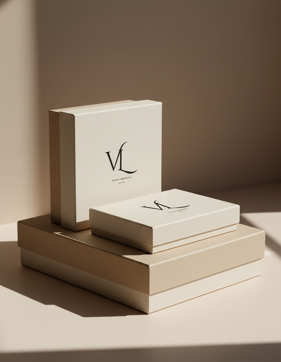
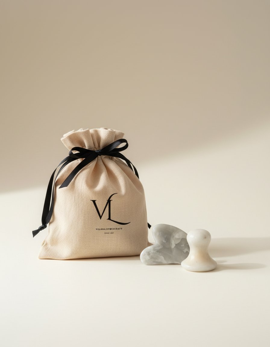
Packaging Design
The packaging system extends the brand's material language into the unboxing experience. Two touchpoints were designed: a rigid paper shopping bag and a branded canvas drawstring pouch — both carrying the VL monogram and "Velora Stonecraft · Since 2017" wordmark.
The imagery below was AI-generated using ChatGPT to visualise the packaging in a real-world context before production — warm natural light, soft architectural backgrounds, and the brand's stone products alongside.
The Outcome
The final identity is a quiet system that lets the work speak first. Every touchpoint feels considered, calm, and unmistakably Velora — a frame that honours the craft inside it.
Prototype
Explore the interactive prototype of the Velora Stonecraft brand and website experience.